
- Home
- Product updates
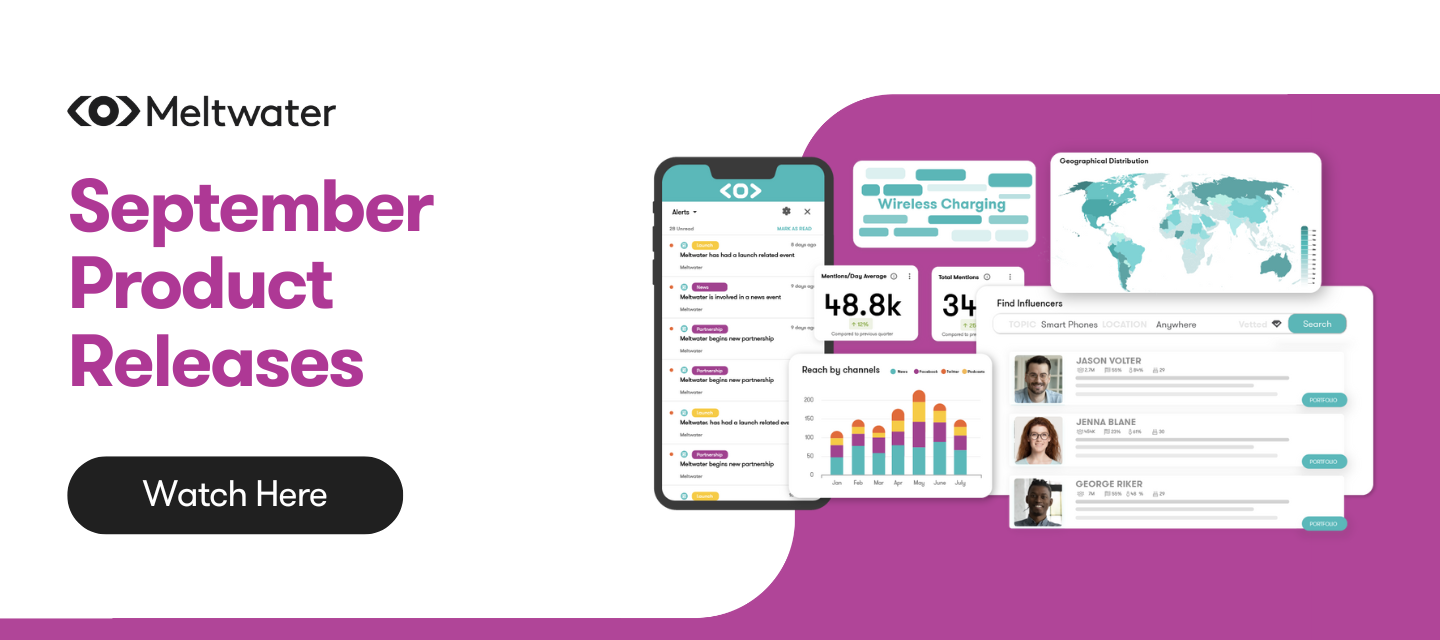
Product Updates
See what’s new at our product, check the updates below
Sep 27, 2024
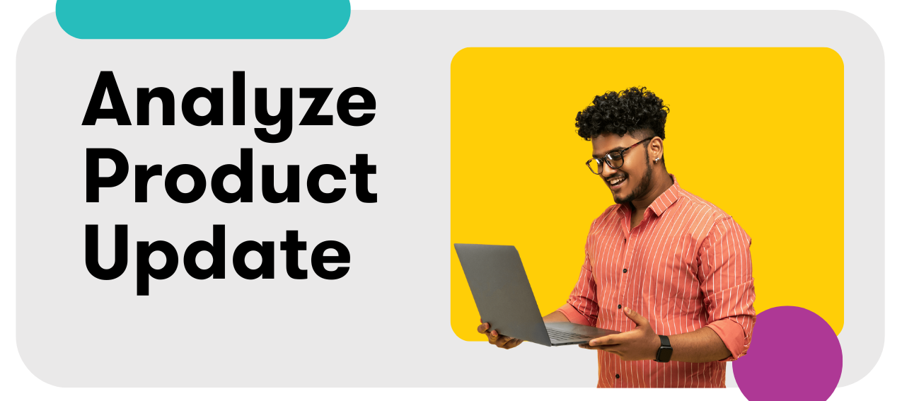
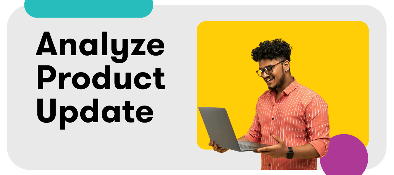
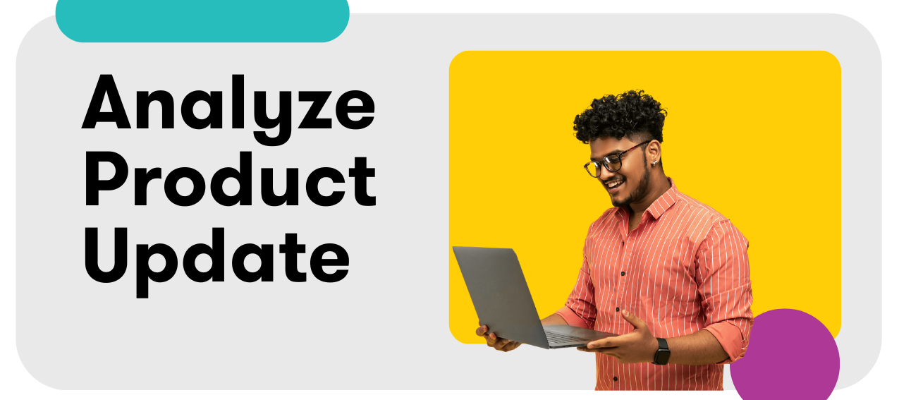
Analyze: Interactive Shareable Dashboards
Challenged with reporting on your brand’s earned media via static PDF? Great news, everyone - we’re combining the convenience of exported reports with the dynamic data visualizations of Dashboards!Empower your stakeholders with more informative reports by sharing a dynamic link. When accessing the report URL, they’ll be able to:Hover over chart visualizations for a more detailed list of how many mentions are in the chart Click to expand a list view of the coverage highlighted, and click again to navigate to the article Click on spikes in coverage to see up to 25 mentions associated with that time period What’s more, views of dynamic links don’t provide edit access, so you can share easily with stakeholders (even if they don’t have a Meltwater login) and rest easy knowing that your carefully build Dashboards are safe from unwanted edits! Learn more in the Help Center:Getting Started with Analyze
Related products:Analyze - Earned Media Measurement
Analyze UpdateSep 20, 2024
Analyze: Power Coverage Reports with Estimated Views
Now you can use Estimated Views as a metric in Coverage Reports (instead of Reach) for a more realistic measurement of earned media impact 🙌 While potential reach is used by many to measure article impact, some find Estimated Views more accurate when benchmarking over time.Build trusted reports: Coverage measured with Estimated Views can provide more accuracy when reporting (instead of potential reach) Customize in report setup: When building new Coverage reports, the Estimated Views metric will appear as an option when selecting the search Click the Content Stream to see all articles: Estimated Views will be featured as a metric on all articles when using the Content Stream insight Learn more in the Help Center:Meltwater: Estimated Views
Related products:Analyze - Earned Media Measurement

Analyze UpdateAug 23, 2024
Analyze Bundle: Highlighted Coverage Insight Improvements + New Content Stream Insight
This bundled release includes a new Content Stream Insight, plus a number of highly-requested improvements for the Highlighted Coverage Insight - helping you take your Coverage Reports to the next level 💪Content Stream Insight Highlighted Coverage Insight Improvements Content Stream InsightHighly requested by Classic Dashboard users, the insight allows you to display a scrollable article stream directly in your dashboard. This insight can be accessed in any Report Template, and features the same customization options as the Highlighted Coverage Insight. Highlighted Coverage Insight ImprovementsWe’ve improved the Highlighted Coverage section available by default in Coverage Reports and to add into any Report Template 📊Real time editing: Hover over an article or post, then click “X” to remove it When you remove an article/post from the Select Mentions view, the dashboard preview updates in real time Image placeholders: We’ve improved the visual appearance of articles and posts without a default image Unique articles or duplicates: By default, only unique (original) articles are shown To include duplicate or similar articles, select them in the content stream Include match phrase: The Insight will include the matched keyword/phrase Better understand at a glance why an article/post is in your report More articles in Coverage Reports: The Highlighted Coverage Insight now supports up to 100 articles (previously 10) Social Sorting: The Social section is now sorted by Engagement (instead of reach) Compact view: Customize your display to fit more mentions in your Dashboard
Related products:Analyze - Earned Media Measurement

Analyze UpdateJul 22, 2024
Analyze: Schedule Reports! Discover Content Measured in Top-Level Metrics
Now you can schedule your Dashboards to be sent to you at a preferred interval. Discover it in your inbox weekly or monthly ✨This update is designed to help keep you and your stakeholders up to date with what you need to know with minimal effort. This new functionality empowers you to:Educate & Inform Stakeholders with ease: Responsible for reporting to stakeholders? If they have a Meltwater account, they can easily set up their own scheduled reports! If they don’t, you can easily forward your own report to them. Eliminate the time spent logging into Meltwater just to access a report: Use the time you get back to action the learnings from your Dashboards, research your findings, or execute your PR strategy 🙌 Know the Media Behind the Numbers: Click on the metrics tiles as the top of your Coverage Report to see the coverage making up the numbers. Most importantly: Scheduling is easy to set up! Click Share to schedule your report weekly or monthly, and scheduled reports will be sent in either PDF or PPT format. Learn more in the Help CenterGetting Started with Analyze > Exporting & Scheduling Analyze Reports & Insights
Related products:Analyze - Earned Media Measurement

Analyze UpdateJul 19, 2024
Analyze: Coverage Report Template
Note: This is an older update that slipped past our radar for Product Updates. This was released on April 25, 2024. Apologies for the omission, but please read on for more info! Analyze: Coverage Report TemplateIntroducing an efficient to new way to showcase your earned media coverage for your stakeholders 📊 Showcase your earned media wins to stakeholders and demonstrate the value of PR efforts with the Coverage Report Template in Analyze. This template aims to expedite the reporting process and increase the visual appeal of reports for campaigns, issues, and specific time periods 🎨The Coverage Report Template is available as a new template in Analyze with branding and customization options that can be reused for future initiatives to maintain consistency and save you valuable time. It can also be exported to PDF to better facilitate sharing with your stakeholders.Earned media coverage can be broken out by Online News, Print Media, and Social 📱For TVEyes customers, dedicated sections for TV and Radio are also included 📺 Learn more in the Help Center:Get Started with Analyze
Related products:Analyze - Earned Media Measurement
Analyze UpdateJun 21, 2024
Analyze: Compare to Same Time Period Last Year
Before this update, the only available comparison option was the previous week, month, quarter, or year. With the latest update in Analyze, you can now select (for example) June 2024 and compare it to June 2023 - or any day, week, month, or quarter to the same period in the previous year 🗓️ ✨This update is available for the following comparison insights:Total Mentions Comparison Total Potential Editorial Reach Comparison Average Sentiment
Related products:Analyze - Earned Media Measurement

Analyze UpdateMay 24, 2024
Analyze: Introducing Key Message Penetration for Insight Reports - New AI-powered Insight! 🤖
Introducing a new PR Insight Reports slide, powered by the new GPT-4o model: Key Message Penetration - our most advanced and innovative AI-powered Insight yet (and some say the coolest 😎)!Key Message Penetration slide helps you analyze and evaluate your media messaging strategy, ensuring that you achieve your desired brand perception with your target audience. It’s available in the Insight Library in PR Insight Reports now ✨ Note: Some Assembly Required 🛠️This Insight requires you to input the key messages you want to analyze when adding the slide to an Insight Report. We provide clear guidance and examples during setup in the UI, and we’ll continue to monitor and improve this process as needed going forward. Learn more in the Help CenterReporting: PR Insight Reports and Comparative Template > Available Insights for the PR Insight Report
Related products:Analyze - Earned Media MeasurementAI

Analyze UpdateMay 17, 2024
Analyze: Earned Media Measurement Report Template + Change the Search Applied to Report Tab
We’re happy to share a bundle of Analyze updates this week! You can learn more about both of these releases in the Help Center: Creating an Earned Media Measurement DashboardOr just keep reading for updates on:Earned Media Measurement Report Template Change the Search Applied to Your Report Tab Earned Media Measurement Report TemplateNow, the Earned Media Measurement report template can be created with the same design and content customization as the first 4 report templates (Coverage, Campaign, Brand, and Benchmark)! Change the Search Applied to Your Report TabThe art of creating the perfect customized report can be exacting and time-consuming. But simply switching the searches that power a great report is a lot more accessible than creating the same report from scratch!With this in mind, it’s now possible to quickly customize the searches applied to an entire report tab by clicking Edit at the top of the tab ✨
Related products:Analyze - Earned Media Measurement
Analyze UpdateMar 29, 2024
Analyze: Introducing Dashboard Templates 📊
Discover Dashboard templates pre-filled with Insights, powered by up to 10 searches or tags, and including up to 25 insights and 5 tabs. Customize them for your reporting needs! 📊 📈 What is it and what’s the value?Build comprehensive earned media Dashboards quickly, with new Dashboard templates ✨Choose from a selection of templates pre-loaded with insights. The new templates include:Brand Report: Understand and report on brand awareness using metrics such as number of mentions, reach, sentiment, coverage by market, and key themes. Benchmark Report: Compare brands, topics, or competitors to understand their share of voice across mentions, reach, sentiment, coverage by market, and key themes. Campaign Report: Analyze and report on mentions from your campaign across various media types, engagement levels, and reach. Highlight the key coverage achieved.Simply choose your template and select up to 10 inputs (searches or tags) to power the Dashboard. The best part? You no longer need to configure each insight!Previously, each insight added to a Dashboard required assigning searches and configuring insights. Now, you create a functional Dashboard powered with insights in just a few clicks! These templates are available right on the Analyze landing page, so you can get your Dashboard up and running in a flash! These new templates are built from industry knowledge and based on customer feedback, to offer a stepping stone into creating industry-leading impactful reports. Notes & Callouts:The current Earned Media Measurement (EMM) template will take you to the classic EMM Dashboards, which are less customizable than the new Dashboards. We plan on rebuilding the EMM template to allow the same level of customization in the coming months. While you can still create Classic Dashboards today, we have been working hard to ensure all critical classic features are available in new dashboards. Fun fact: over 55% of all Dashboards being viewed in Meltwater are new Dashboards! Learn more in the Help Center:Getting Started with Analyze > Creating a Dashboard
Related products:Analyze - Earned Media Measurement
Mar 27, 2024
Engage: Meta Updates to Facebook Metrics
Exciting news from the digital frontiers: Meta is making changes to their Facebook metrics in its native reporting and API! March 2024 marks the debut of some key changes in the way we analyze our social media success. If you're keen to dive deeper, grab a cup of your favorite beverage and explore their original announcement. Now, let's chat about what this means for Engage. The deprecation only impacts three metrics in Engage:‘Page fans by gender and age’ has become ‘Impressions by age and gender’ ‘Page fans by gender and age’ provided the demographics of people following your page. It is being replaced by the new ‘Impressions by age and gender’ metric. ‘Impressions by age and gender’ will now provide the demographics of people viewing your posts. You can expect ‘Impressions by age and gender’ to be a smaller number compared to ‘Page fans by gender and age.’ Though smaller, we believe this metric will be more insightful and dynamic as it looks at the people consuming your content. By comparison, the demographic of Page followers are not likely to change significantly over time. The updated metric will impact the Facebook Overview templates (both legacy and in Measure). ‘Page-engaged users’ has become ‘Post-engaged users’ ‘Page-engaged users’ provided engagement activity at the Page level for a given time frame. The new ‘Post-engaged users’ provides engagement activity at the post level for all posts published within a given time frame. What’s the key difference? There’s nuance here. ‘Page-engaged users’ did not consider the publish date of posts. So, for example, let’s say your time frame is the past 7 days. If a post published 12 months ago received engagement in the past 7 days, the ‘Page-engaged users’ metric would capture it. Differently, ‘Post-engaged users’ only captures activity from posts published within the past 7 days. The updated metric will impact the Facebook Overview templates (both legacy and in Measure). Engagement rate has been recalculated Facebook recently recalculated the engagement rate in its native reporting. Previously, it was calculated by dividing total engagement by post-engaged users. Now, It calculates it by dividing total engagements by reach. We have recalculated our engagement rate to match Facebook’s new formula (total engagements divided by reach). The change will drive greater consistency between the reporting you do across native and in Engage. The updated calculation will impact the Cross-Channel Overview and Facebook Overview templates (both legacy and in Measure). The changes went into effect on March 21, 2024, and only impact data from March 21, 2024 onward. Historical Data Updates But wait, there's more!We will now store historical data across Conversations, Publish, and Measure for as long as you are a customer. Previously, on average, we stored and surfaced data for no longer than 15 months. *This will continue to be 15 months for X/Twitter replies and mentions. Going beyond 15 months of data will help you in a number of ways. You’ll be able to run reports looking at your performance over multiple years, revisit an old thread with a loyal fan, or view analytics of your best-performing posts from years past.
Related products:Analyze - Earned Media MeasurementEngageMeasure

Analyze UpdateMar 23, 2024
Analyze: Manually Adjust AVE and Data Density
Understand your Advertising Value Equivalency (AVE) in more currencies, apply data density options to control how your charts appear What is it, and what’s the value?Introducing more customization options for how to display data within dashboards.Choose from local currencies to display when calculating AVE (Advertising Value Equivalency) in Dashboards and customize the conversion (attribution) rate. Use the new data density option to adjust how data is displayed over time within a chart by choosing to see your data broken down by hourly, daily, weekly or monthly. Previously, AVE was only available for calculation in USD, and data density was limited. These options give you more flexibility to convert to your local currency and to better align charts to your company’s reporting needs, so you can better demonstrate the impact of your PR efforts. Learn more in the Help Center:PR Metrics (Reach, Social Echo, Sentiment, AVE, Custom Scoring)
Related products:Analyze - Earned Media Measurement

Meltwater UpdateMar 22, 2024
Meltwater: Sensitive Content Warning in Image Previews + Highest Syndicated Article Default View
Two updates this week to improve your content previewing experience!Sensitive Content Warning in Image Previews Highest Syndicated Article Default View Sensitive Content Warning in Image PreviewsNow you can decide what you want to se, and what you don’t when scrolling through previews What is it and what’s the value?Introducing a “Possibly Sensitive” content warning on article or post previews.Within Meltwater, a small percentage of content is recognized as potentially sensitive. We’re empowering users by adding a blur to the content preview, which can be exposed by clicking “show” Users are warned if the content might not be suitable. For PR and Marketing pros in high-risk industries, or those prone to large amounts of spam, sensitive content like violence or NSFW images can be automatically blurred Available for content in Explore, Analyze, Monitor, and Author Segments Learn more in the Help Center:Getting Started with Explore Highest Syndicated Article Default ViewEasily understand which article made the biggest impact in a group of syndicates, with Highest Syndicated Reach now available on editorial article previews in Meltwater What is it and what’s the value?The article with the highest reach is now surfaced on the top article in a duplicate set.Previously, relevant content could be overlooked due to large duplicate groupings Understand which article likely had the highest impact measured by reach at-a-glance, and action it without expanding to see duplicates Visible on editorial articles in Explore, Analyze, Monitor, Media Relations, and Author Segments Learn more in the Help Center:Getting Started with Monitor
Related products:ExploreMonitorAnalyze - Earned Media MeasurementMedia RelationsAuthor Segments

Analyze UpdateMar 8, 2024
Analyze: Upload an Image in Dashboards + Remove Words from Word Cloud
Two updates to Dashboard insights help you deliver more valuable and relevant insights to stakeholders Upload an Image in Dashboards Remove Words from Word Cloud Upload an Image in DashboardsNow, you can upload an image directly into your Dashboard, without using an external link generator 🖼️ What is it?Introducing a highly requested feature: the option to upload a PNG, JPG, or GIF file directly into your Dashboard using the Custom Image Insight. What’s the value?Now, you can upload an image to display your brand logo, the Dashboard’s initiative, or apply it to your slide background in Dashboard Reports. Stay in Meltwater: You no longer have to sign up with external imag-hosting sites to create image links when adding your images in Dashboards. Learn more in the Help Center:Get Started with Analyze > Building your own Dashboards Remove Words from Word CloudCustomize the words and phrases displayed in your word cloud insights with ease! What is it?Before this update, word clouds sometimes contained redundant or irrelevant words to the report, making the word cloud less valuable for reporting to stakeholders.Now, you can remove repeated or irrelevant words/phrases in Insights that use the word cloud visualization. Hover over the word cloud options to see which words have been removed. What’s the value?Craft your narrative and report on metrics that matter with added control over the words in your word cloud. Want to bring a word back in? Reduce confusion and maintain more control in the file result with the option to bring back any hidden words. Learn more in the Help Center:Get Started with Analyze > Building your own Dashboards
Related products:Analyze - Earned Media Measurement

Analyze UpdateFeb 23, 2024
Analyze: Date Range Selections + Total Insights in Dashboards
Introducing more granular date selections and four new insights in Dashboards! What is it?3 new date selections in Dashboards: Last Week Last Month Last Quarter 4 “Total” Insights: Total Reach Total Potential Social Reach Total Social Echo Total Advertising Value Equivalency (AVE) What’s the value?The new date range selectors match common reporting intervals, and remove the room for error when manually selecting dates Use Total Insights to understand your brand’s earned media impact so you can inform and influence key stakeholdersScreenshots: Learn more in the Help Center:Dashboards: Insights Catalog
Related products:Analyze - Earned Media Measurement

Report UpdateFeb 2, 2024
Reporting Update: Introducing Estimated Views for Earned Media Measurement
Introducing an additional metric for your earned media measurement! What is it?Estimated Views is a metric that approximates the number of times and average article from a publication has been viewed. It’s calculated by dividing a publication’s monthly page views by the number of articles it published in a given month. Additional logic is applied to eliminate outliers.Estimated Views are found across Meltwater, in Insight Reports, Dashboards, Explore, Media Relations, API (exports and streaming), and Content Stream Exports. What’s the value?Estimated Views offers a more realistic approximation of how many people may have viewed an article. As a result, the aggregate values are more relatable and trustworthy when used in a report outlining the impact of a campaign or an issue. With Estimated Views, you can rely on a more realistic metric across your Earned Media reporting, and find more simplified benchmarking for continued reporting. Screenshots: Learn more in the Help Center:Meltwater: Estimated Views
Related products:ExploreAnalyze - Earned Media MeasurementMedia RelationsReportContent, Tags, Alerts, & Labels

Analyze UpdateFeb 2, 2024
Analyze: New Share of Voice by Engagement Insight
Introducing a New Way to Measure Your Impact: Share of Voice by Engagement What is it?Unlock a fresh perspective on how your brand stands out with our latest insight, Share of Voice (SOV) by Engagement.This new addition to our Analyze section goes beyond traditional metrics like reach and volume. It allows you to see how your brand or product compares to others based on actual engagement across news, social media, and more. The SOV by Engagement insight supports up to 25 different inputs. What’s the value?Move past older metrics such as Advertising Value Equivalent (AVE) and simply counting mentions. Now, gauge your brand’s visibility based on meaningful social media interactions. Gain insights into your brand’s earned media impact, providing you with powerful data to guide your strategy and communicate your success to key stakeholders.Engagement metrics are are calculated based on specific types of interactions that differ slightly between social platforms: Facebook - Total number of Posts, Likes, and Comments. X (formerly Twitter) - Amount of times content has been posted or reposted. Reddit - Total number of shares across the top 17,000 most popular subreddits. (From Oct 2019 onwards) Learn more in the Help Center:Dashboards: Insights Catalog
Related products:Analyze - Earned Media Measurement

Media Monitoring UpdateFeb 1, 2024
Media Monitoring: Maximum Tagged Articles Up to 1,000 (from 500)
Double the tagged documents, double the time saved on media monitoring! What is it?As part of our continuous efforts to improve performance across the Meltwater app, we’re doubling the max number of tagged documents in the content stream for Monitor, Author Segments, Explore, Analyze, and Media Relations.Now, you can tag a maximum of 1,000 articles or posts, up from 500! What’s the value?We know you spend a lot of time working through content in the stream processing mentions. We’ve implemented this quality of life improvement so you can double your output and save time.Boost your productivity and review a greater volume of content by actioning it swiftly and intelligently. Learn more in the Help Center:How to Use Tags to Get Organized
Related products:ExploreMonitorAnalyze - Earned Media MeasurementMedia RelationsContent, Tags, Alerts, & LabelsAuthor SegmentsMeasure

Analyze UpdateJan 26, 2024
Analyze: More Inputs per Share of Voice Insight in Dashboards
Now, Share of Voice Insights in Dashboards can be powered by up to 25 inputs! What is it?Previously, you were limited to comparing up to 10 inputs in Insights measuring Share of Voice. With this update, you can compare up to 25 brands, competitors, or other criteria with one Insight. What’s the value?Discover more comprehensive benchmarking by SOV (Share of Vocie), report on earned media more effectively, and trust the reports you’re sharing with stakeholders.Advanced Benchmarking: compare more brands and competitors than previously possible in one view Tell a more comprehensive story: compare up to 25 inputs for a combined Insight instead of separating across multiple Insights Notes:In order to view all 25 inputs in the legend, you must expand the Insight. In Report Layout, it will not be possible to make the Insight large enough to display all inputs in the legend. Instead, they will be available in the overflow menu. The overflow menu will not display on PDF/PPT/Gslide download, but will display in a shared Dashboard link. Future released will enhance the donut visualization to show more inputs in the legend. Learn more in the Help Center:Getting Started with Analyze Dashboards
Related products:Analyze - Earned Media Measurement

Meltwater UpdateJan 11, 2024
Media Monitoring: Faster Performance with Light-Speed Tagging
Tag content in Meltwater, instantly. We're reducing the time spent organizing your content with tags, for continued speediness and ease of use in Media Monitoring! What is it?As part of our continuous efforts to improve speed and performance across the Meltwater app, we’re introducing faster tagging in content streams found in Monitor, Author Segments, Explore, Analyze, and Media Relations.What's the value?Tag content instantly for future monitoring, at the click of a button No more extended loading delay when you save content to a tag Get to the work you need to do faster with less time spent on manual effort
Related products:ExploreMonitorAnalyze - Earned Media MeasurementMedia RelationsAuthor SegmentsMeasure

Analyze UpdateJan 5, 2024
Analyze: Top Journalists
Showcase landed coverage in Dashboards, Top Journalists surfaces who’s writing about your brand, campaign, or topic. What is it?Introducing two new insights now available in Dashboards: Top Journalists by Volume and Top Journalists by Reach. What’s the value?Understand the impact of your media coverage, or research journalists for future outreach. Know who to contact in the case of a correction, media opportunity, or further research on a topic of interest. Discover media opportunities and demonstrate impact. Screenshots: Learn more in the Help Center:Getting Started with Analyze: Dashboards
Related products:Analyze - Earned Media Measurement

Analyze UpdateJan 3, 2024
Analyze: Top Entities, Engagement Trend by Source Type
These insights in Dashboards bring you more ways to report on earned media! What is it?Introducing to new insights now available in Dashboards:Top Entities Engagement Trend by Source Type What’s the value?Showcase your earned media impact with two new insights in your Dashboard, displaying the Engagement Trend over time in a line graph and Top Entities in their own insight views. Drill down into an insight to see the featured content behind the chart. Screenshots: Learn more in the Help Center:Getting Started with Analyze: Dashboards
Related products:Analyze - Earned Media Measurement

Analyze UpdateDec 1, 2023
Analyze: Show All Content Powering an Insight and Filter Update
Announcing two enhancements to Dashboards, saving you time when creating a Dashboard. What is it?Now you can expand all the content assigned to an insight, as well as select all when updating your language or location using the Filters feature in your Analyze Dashboard. What’s the value?See all Content powering an Insight: Trust the data and tell the complete story to stakeholders with confidence. Previously, to see content behind an insight, a specific date or chart selection had to be expanded. Now, you can see all the data behind an insight without being limited to what’s tin the chart or date selection. Select All when using Filters for Language or Location: Sometimes, you have a specific language or location you’d like excluded rather than included. Now, instead of selecting manually, you can select all before making more changes in the settings. Screenshots: Learn more in the Help Center:Getting Started with Analyze: Dashboards
Related products:Analyze - Earned Media Measurement

Analyze UpdateNov 17, 2023
Analyze: News Media Type Analytics Insights Bundle
Discover analytics that organize metrics by news media type in Dashboards! What is it?Addressing a common need for more detailed PR reporting in Dashboards, we’re introducing a new set of insights that break down metrics across news media types: TV, radio, online news, and print news. As part of this release, we’re also introducing a new insight called Mentions Trend by Source Type. What’s the value?With these new insights in Analyze, you can now drill down into your analytics by Online, TV, Print, or Radio when reporting on earned media.Now, you can answer questions like:“Is my campaign resulting in engagement differently across print and online media?” “In which media type is my competitor surpassing or underperforming in terms of SOV?” “Did the weekly mentions trend for Radio differ from TV during a spike in coverage?” Screenshots: Learn more in the Help Center:Dashboards: Insights Catalog
Related products:Analyze - Earned Media Measurement

Analyze UpdateOct 26, 2023
Analyze: Dashboards + Social Reach Insights Bundle
These two Analyze updates help you deliver beautiful and insightful reports for C-level teams:Introducing Dashboards What is it? What’s the value? Learn more in the Help Center: Social Reach Insights Bundle What is it? What’s the value? Screenshots: Learn more in the Help Center: Introducing DashboardsPreviously known as Custom Dashboards, we’re now combining the best of our earned media analytics into one build-your-own dashboard! What is it?Unlock earned media analytics with Dashboards – your all-in-one solution to monitor, understand, and report on your brand initiatives, with industry-standard metrics and consistent data transparency.We’re introducing two options for building dashboards to fit your intended use case - daily interactive dashboards, and stylized dashboard reports.Dashboard Layout helps you build an at-a-glance overview of your chosen KPIs. Use it for quick and easy measuring, and analyzing of your active PR efforts. Report Layout is your place to build an organized view of your metrics in a collection of slides - these can be shared as PDF, PPT, Google slides, or a Shareable Link.What’s the value?By combining an interactive daily workspace and the flexibility for external presentations, we’re making the journey more complete in Dashboards, ensuring accuracy and predictability in the final result's content and design. These updates will enable you to:Showcase the metrics that C-level teams expect. Improved transparency in KPI tracking can build confidence in effective attribution of PR results. Save time in creating reports that mirror exactly what you see in the platform. A greater level of control over the data in the dashboard, to demonstrate meaningful impact and trust the data you’re presenting. Quickly & easily showcase earned media wins, with benchmarked reporting for continuous narratives. Establish a streamlined, repeatable workflow with new Dashboards. Learn more in the Help Center:Getting Started with Analyze: Dashboards Social Reach Insights BundleUnlock social reach analytics in your Dashboard view for a more complete brand overview. What is it?Introducing three new insights now available in Dashboards:Social Reach by Source Social Reach Trend Top Posters by Social Reach What’s the value?Understand the impact of social posts in your Dashboards to compare post reach with other metrics in one view.Use Social Reach Trend by Source Type to identify the size of a potential audience split out by sources. For a list of the most prominent social profiles posting about a brand, industry, or competitor, use Top Posters by Social Reach Leverage Social Reach Trend to compare Social Reach for one or more inputs over time. Screenshots: Learn more in the Help Center:Dashboards: Insights Catalog
Related products:Analyze - Earned Media Measurement
Filter by product
- All products
- AI
- Analyze - Earned Media Measurement
- Author Segments
- Content, Tags, Alerts, & Labels
- Engage
- Explore
- General
- Klear
- mCommunity / mAcademy / Help Center
- Measure
- Media Relations
- Mobile - Engage
- Mobile - PR
- Monitor
- Newsfeed
- Newsletters
- Radarly
- Report
Enter your E-mail address. We'll send you an e-mail with instructions to reset your password.
Scanning file for viruses.
Sorry, we're still checking this file's contents to make sure it's safe to download. Please try again in a few minutes.
OKThis file cannot be downloaded
Sorry, our virus scanner detected that this file isn't safe to download.
OK