


We’ve all been there — dashboards full of outdated widgets, searches with clutter from months ago, and tabs you swear you were going to close up back in Q4.
Let’s make 2026 the year you actually do it.
Whether you’re launching new campaigns, kicking off reporting, or just want a tidier workspace, here’s how to clean up your current settings and set up your Analyze for a fresh start — using Peloton as an example.
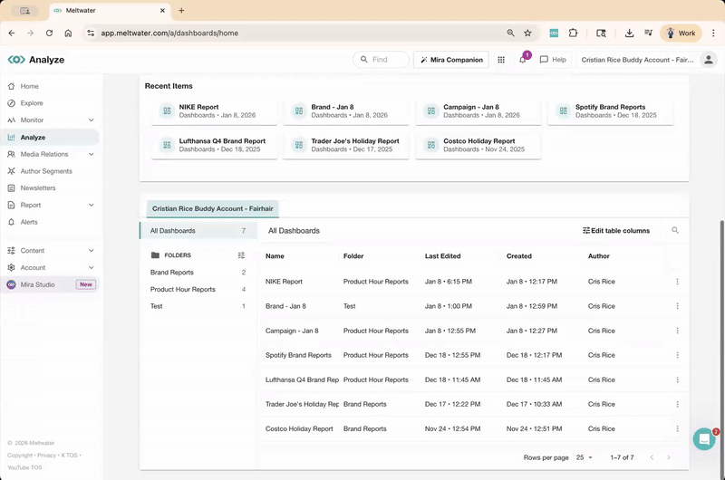
🧹 Clean Up Your Analyze Page
Before you start building something new, take a quick lap through your old dashboards.
Ask yourself:
- Do I still use this?
-
Is it tied to a specific campaign or timeframe (like Q4 2025, Holiday Recap, or 2025 Year-End KPIs)?
-
Would I need to reference this again or is it outdated?
If you want to keep it, organize it. Create folders with names like:
-
2025 Reports -
Summer Campaigns -
Q2 Competitor Report -
Archived – Do Not Delete
To move a dashboard into a folder or delete, go to the Analyze > click the three dots menu (⋯) next to last year’s dashboards > choose Move or Delete.
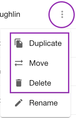
Want to reuse the report? Select Duplicate instead.
💡 Pro tip: You can create unlimited dashboards and folders — so don’t worry about running out of space. Keep your 2026 workspace clear and focused!
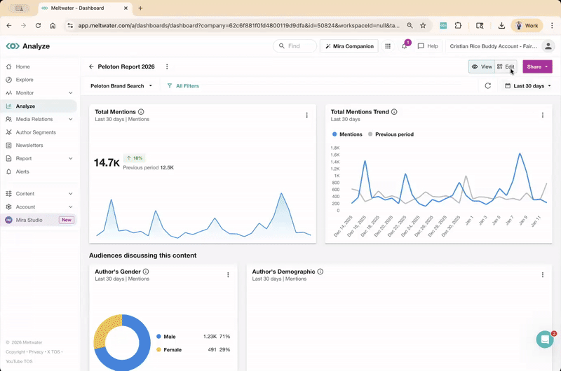
🆕 Create a 2026 Dashboard from a Template or a 2025 Copy
Let’s say you’re kicking off the year at Peloton and want a clean slate to track 2026 initiatives, whether that’s your “New Year, New You” campaign, a launch, or just a centralized place to analyze brand health moving forward - here’s how to start:
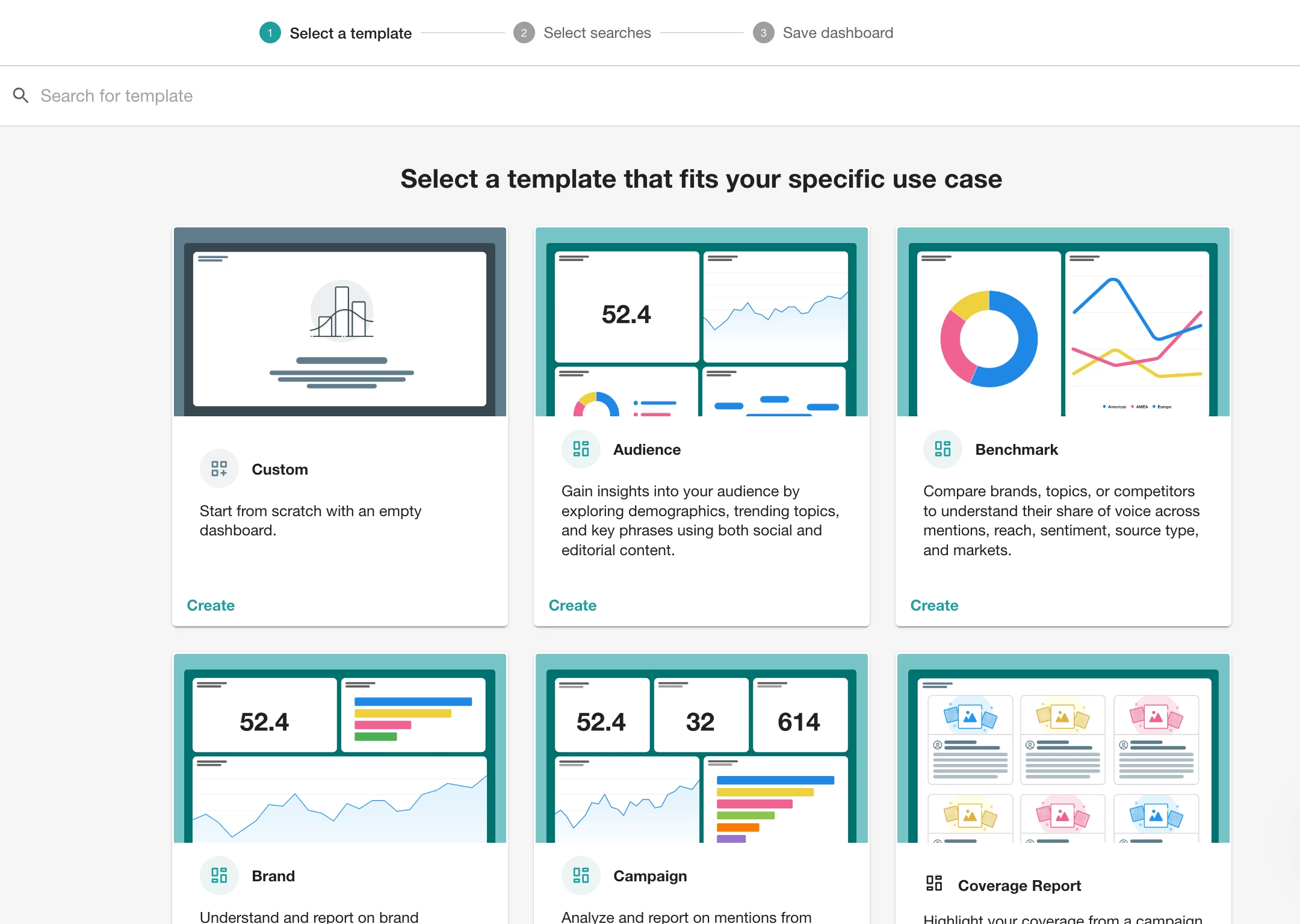
Option 1: Create from a template
Meltwater offers several pre-built templates to help you get started fast. You select the searches, the filters and widgets to suit your reporting goal.
-
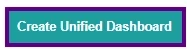
Go to Analyze > click the Create Unified Dashboard
-
Select a layout like:
-
Brand
-
Campaign
-
Benchmark
-
Option 2: Duplicate a Dashboard That Worked For You
Did your dashboard deliver great value last year? Duplicate the report and tweak the date range, filters and you’re good to go.
💡 Pro tip: Set up one dashboard as your “master layout,” then duplicate it anytime you need a similar report for a new region, campaign, or team.
➕ Use Tabs to Organize Everything in One Place
Now that you’ve got a clean 2026 dashboard started, it’s time to organize your reporting and Tabs are your secret weapon.
Imagine you’re building a Peloton 2026 Brand Dashboard. Instead of cramming everything into one page, use tabs to split out widgets by focus area, like this:
-
Brand Health
-
Campaign Performance
-
Influencer Mentions
-
Competitive Tracking
That way, each team can easily find what they need and you don’t have to create a dozen separate dashboards.
How to Add a Tab
-
From your dashboard, switch to Edit Mode
-
Click the ➕ next to the current tab
-
Choose your preferred layout
-
Select the Searches or Tags
-
Click View to lock it in
🧩 Copy Your Favorite Widgets
Instead of selecting widgets from scratch every time, copy the ones that worked and paste them into your new dashboard.
Peloton can use this to see their sentiment breakdown quarter-over-quarter.
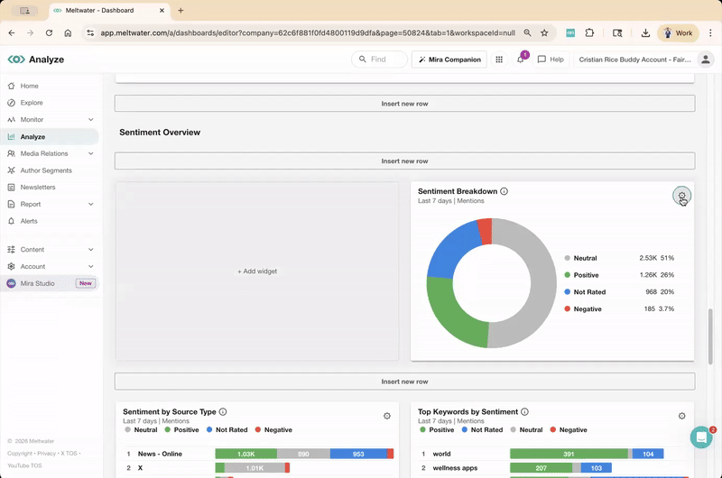
To copy + paste a widget:
-
While in Edit mode, click the gear icon on any widget
-
Select Copy widget
-
Click Add Widget
-
Your copied widgets will appear right at the top to select!
🧼 Use Filters & Tags to Stay Organized
You’ve got your shiny new 2026 dashboard organized by tabs, full of widgets, ready to wow your team. But as new data rolls in, things can get messy fast.
Here’s how to keep your dashboard tidy from the start:
🔍 Filters
Apply filters for sentiment, location, language, or source type directly within the widget — especially if different teams want different views (e.g., global vs. US-only).
🏷️ Tags
Use Tags in Analyze dashboards to examine content like:
-
Key Mentions
-
Press Releases
-
Negative Feedback
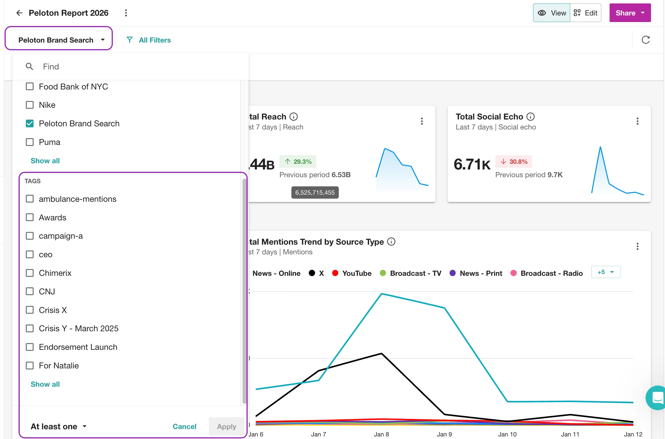
Then build widgets filtered to each tag. Read how to create, apply and report on certain Tags here.
🚴 Ready for 2026?
You’ve got a clean Analyze page, a new dashboard that works for you, and widgets that won’t make you confused. Don’t forget to join our Get Started with Report Building workshop this month— perfect for new users.
👇 Tell us in the comments: What’s the first thing you're tracking in 2026? Volume of Mentions? Reach? Sentiment for a specific product? 👇