


To create a custom dashboard, follow these steps:
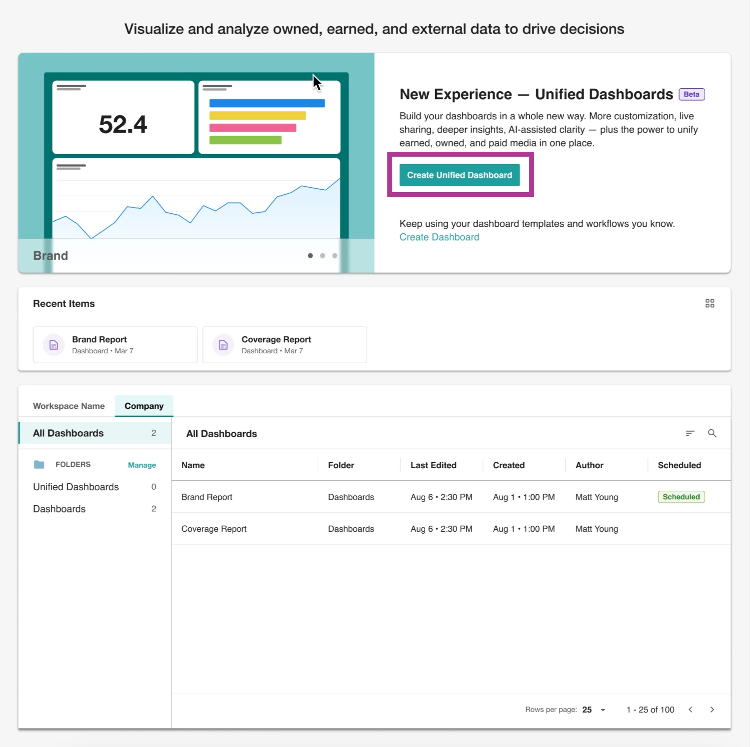
- Click Analyze in the left-hand navigation bar
- Select Create Unified Dashboard
- Click Custom template
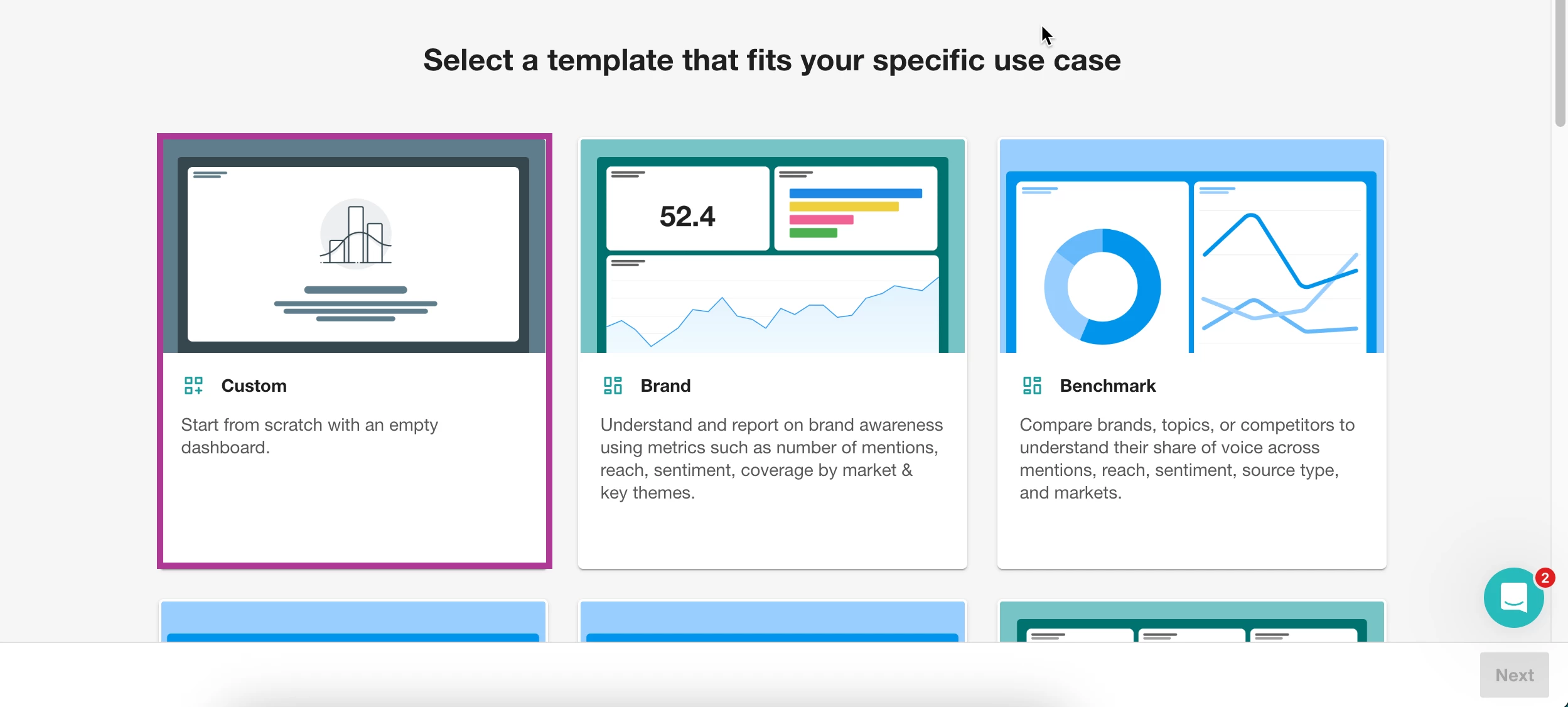
- Select Next
- Name your dashboard
- Select a folder. Learn more about Creating and Managing Folders.
- Click Create
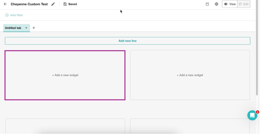
- A blank dashboard will open, and you will automatically be in Edit mode
- To add insights to your dashboard:
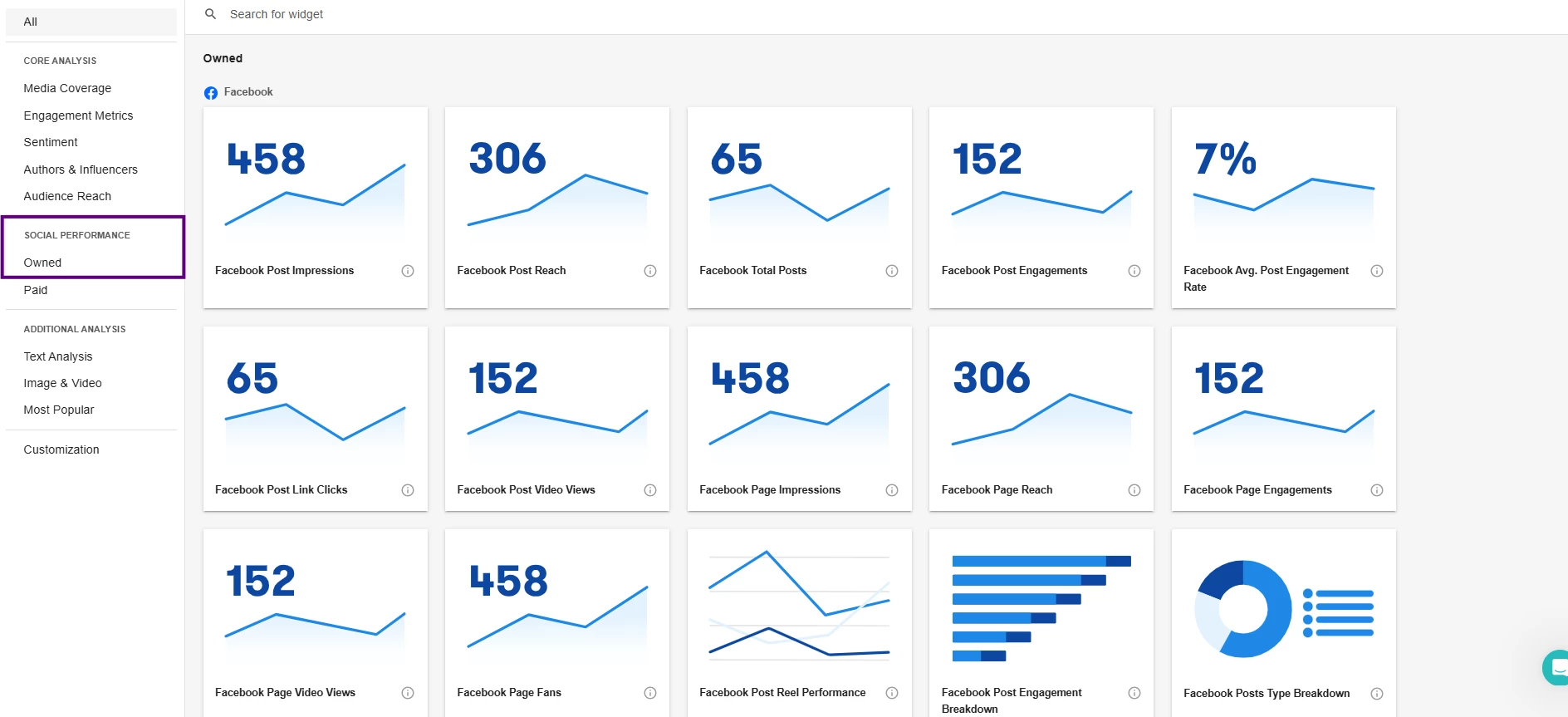
- Click +Add new widget
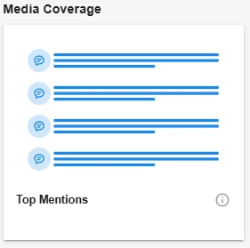
- Select a widget you want to add. Learn more about the Insights Widgets Catalog. A preview pop-up will appear
- In the top left-hand corner, click Select Searches (You will need to select the saved Explore Search(es) that the dashboard will be based on.)

- Add any filters if necessary. Learn more about Filters.
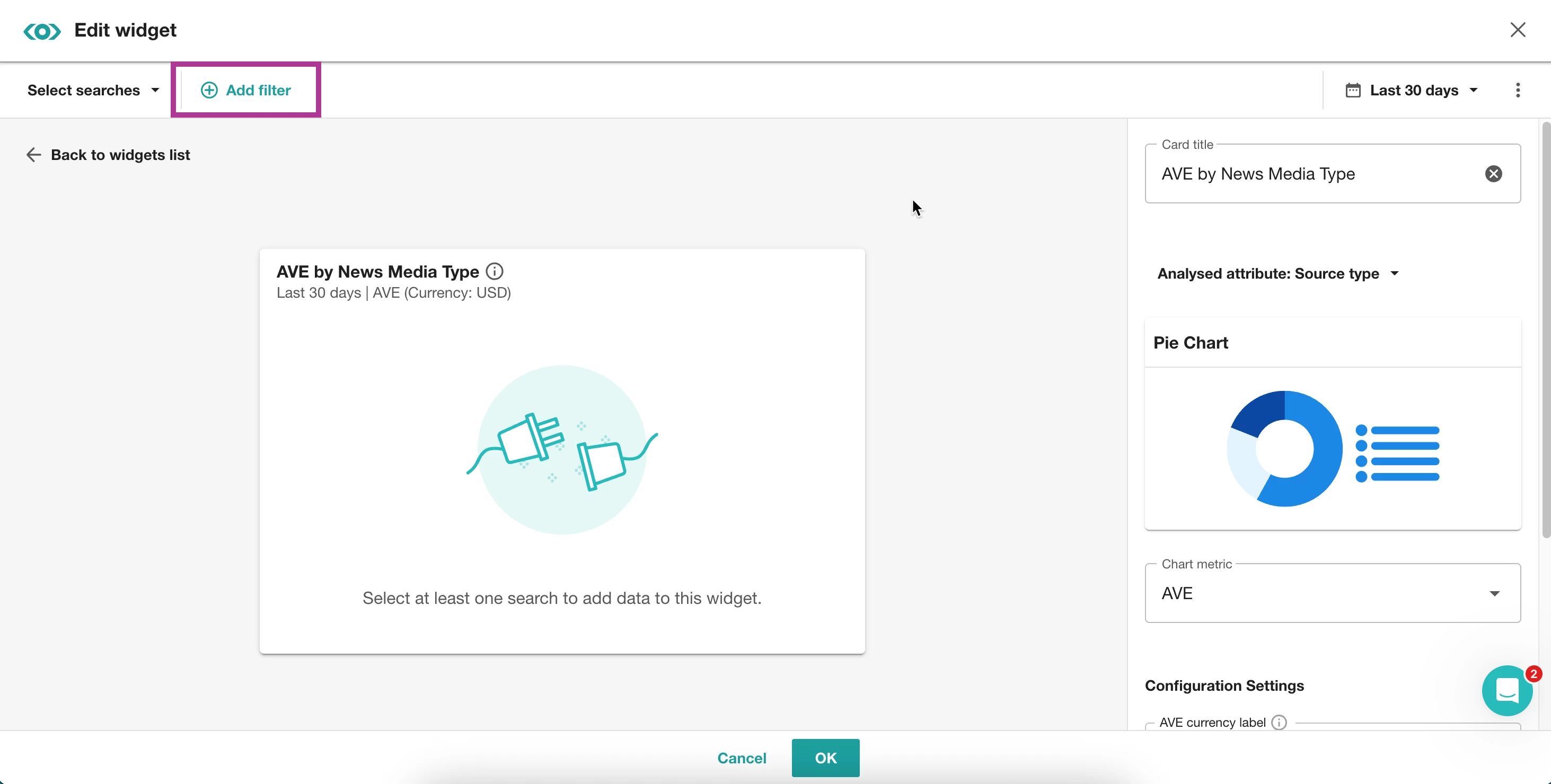
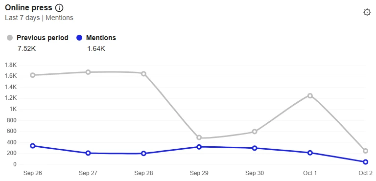
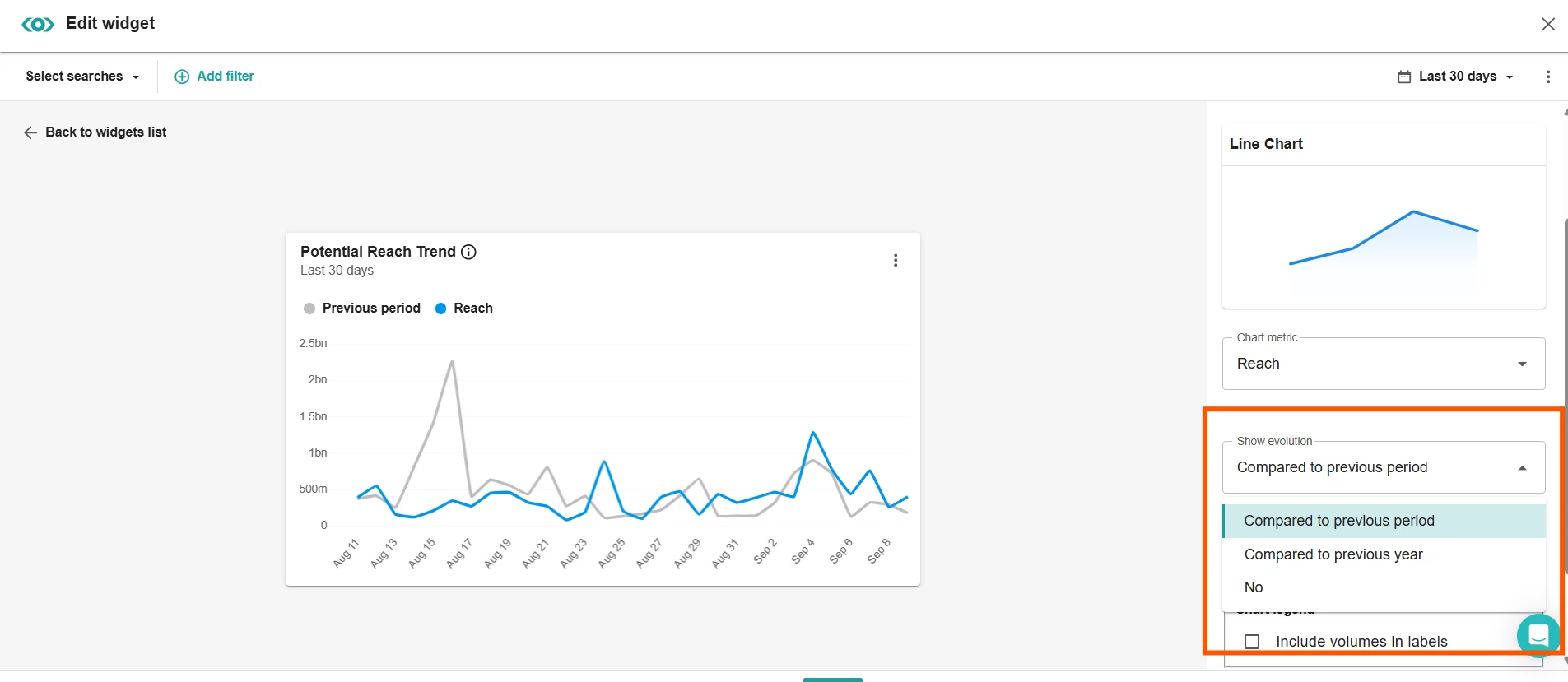
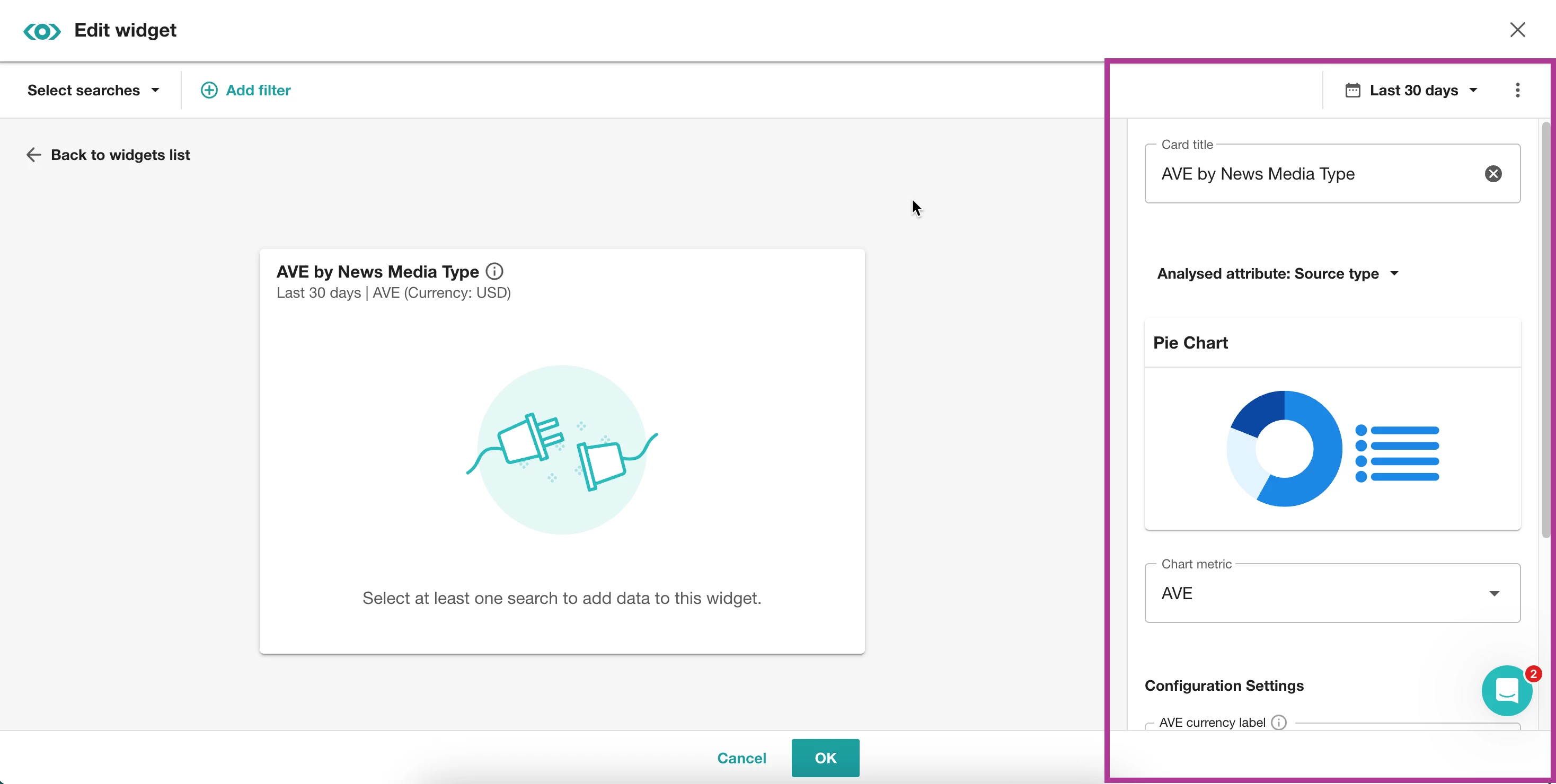
- In the right-hand slide-out, make any necessary adjustments to details like date range, card title, chart metrics, etc.
- Click OK
- Click +Add new widget
Note: You can add up to 45 widgets per tab (up to 15 rows per tab and up to 3 widgets per row).
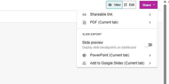
Learn more about the Insights Widgets Catalog.