

☕ How to Compare Competitors in Meltwater This Quarter (Beyond the Numbers)
You’re trying to understand how competitors like Starbucks and Dunkin performed this quarter but looking at mentions alone doesn’t explain why one brand is gaining momentum over another.
This guide walks through how to compare brands and trends, understand what’s driving spikes, and turn that into something you can actually share.
→ By the end of this guide, you’ll know how to build a competitor comparison, identify what’s driving coverage, and explain those insights using both dashboards and AI analysis.
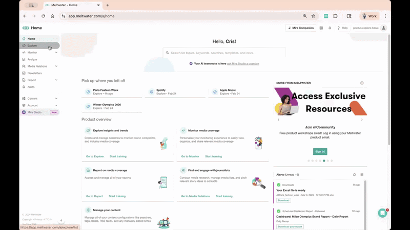
Step 1: Orient — Start with a clean search and build your comparison
Before you compare anything, make sure you’re working from a solid foundation.
Your action:
- Create or review a Saved Search in Explore (ex: Starbucks, Dunkin, or even a broader trend like “spring drinks”)
- If needed, use the AI Search Assistant to refine it
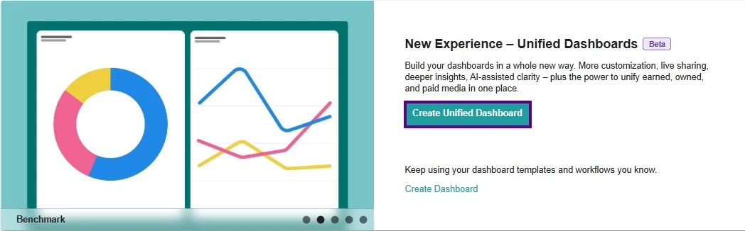
- Once saved, go to Analyze and Create Unified Dashboard using those searches
Once you’re there:
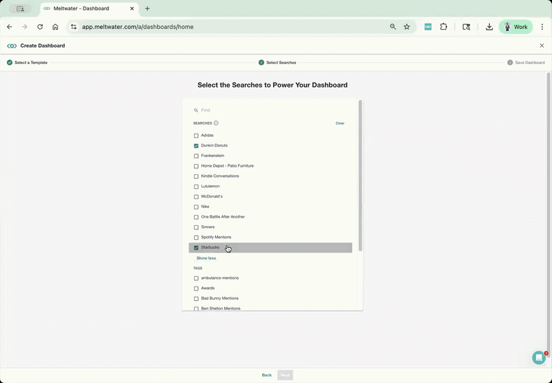
- Choose a template → Start with the Benchmark Report (best for comparing competitors)
- Select your saved searches (ex: Starbucks + Dunkin) → Give your report a name
- Set your date range to This Quarter or Last Quarter (for Q1 2026)
What you’re doing here:
👉 Building a side-by-side view of performance + trends, not just pulling mentions
Step 2: Evaluate — Compare performance and spot meaningful differences
Now that your dashboard is set, start reading what’s happening.
Focus on:
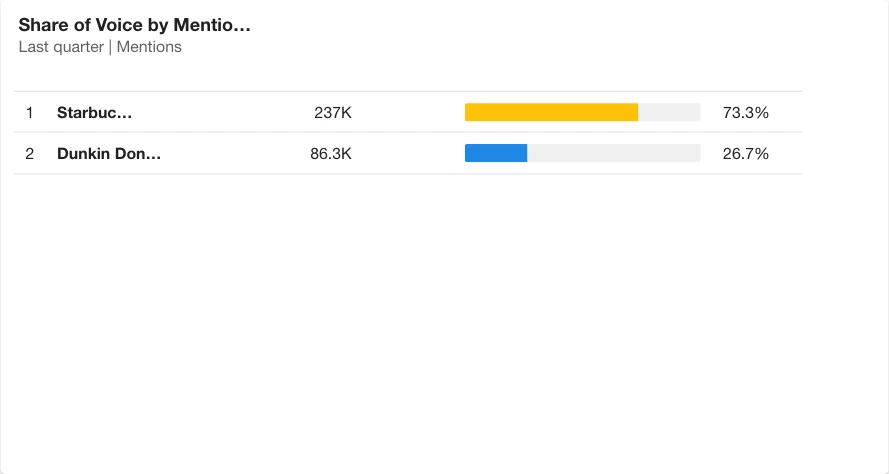
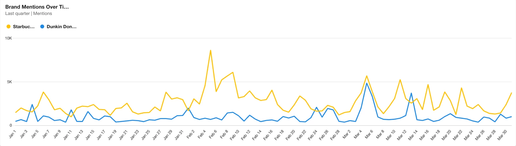
- Share of Voice: Who is leading overall?
- Mentions Over Time: When are spikes happening?
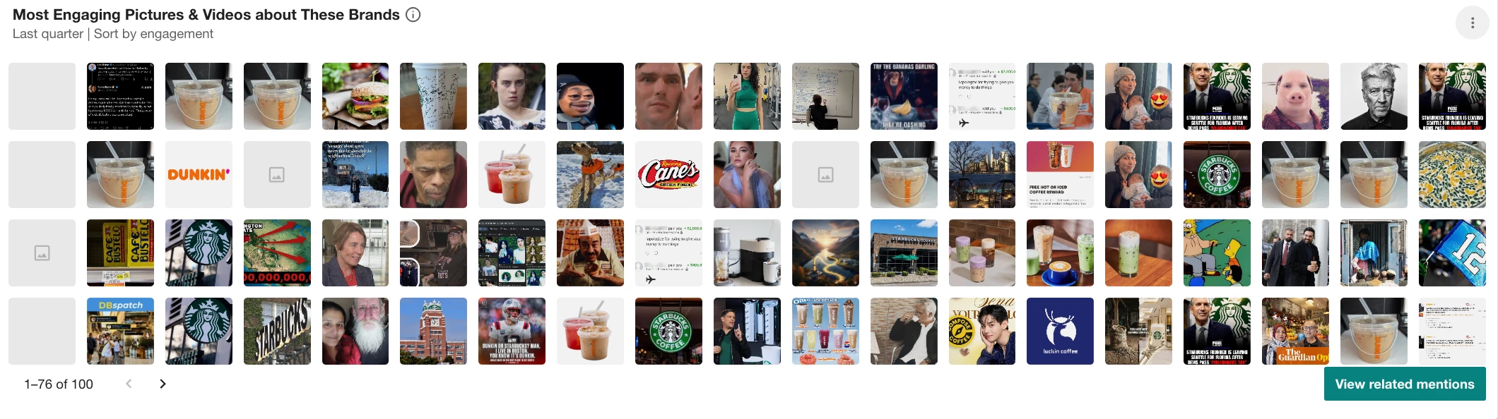
- Most Engaging Pictures & Videos: Which brand appears most in high reaching images and videos across coverage?
But don’t stop at the charts, this is where most users get stuck.
To understand spikes, use what’s already in the platform:
- Click directly into a spike in the trend chart to see the exact coverage driving it
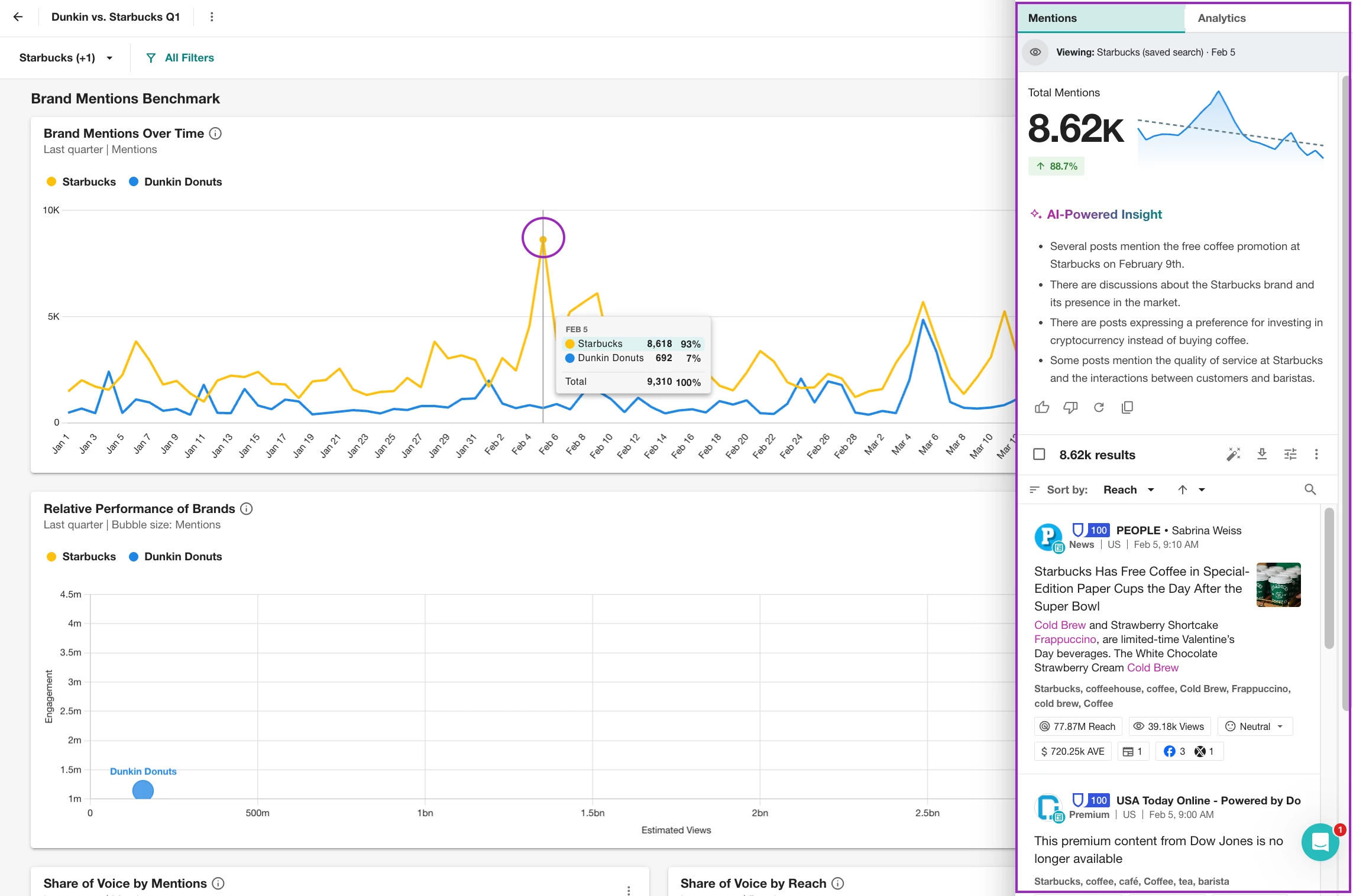
- Use the AI insight (lightbulb icon) in Explore/Analyze to summarize what’s happening
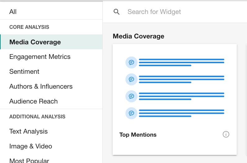
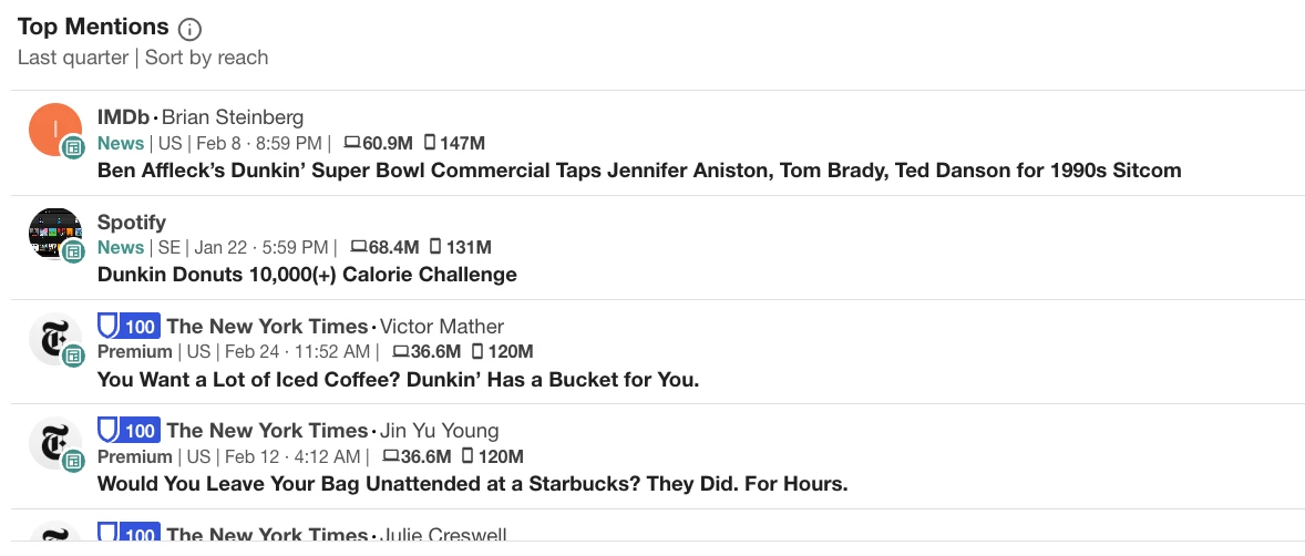
- Add the Top Mentions widgets and review top mentions or publications tied to those brands
For example:
- You might see a spike for Starbucks
- Clicking into it shows coverage tied to a new post-Super Bowl drink launch
- The AI insight highlights increased engagement around that campaign
Now you’re not guessing—you’re validating what actually caused the spike.
Step 3: Explain — Use Mira to compare narratives and positioning
Once you know what happened, use Mira to understand why.
Your action:
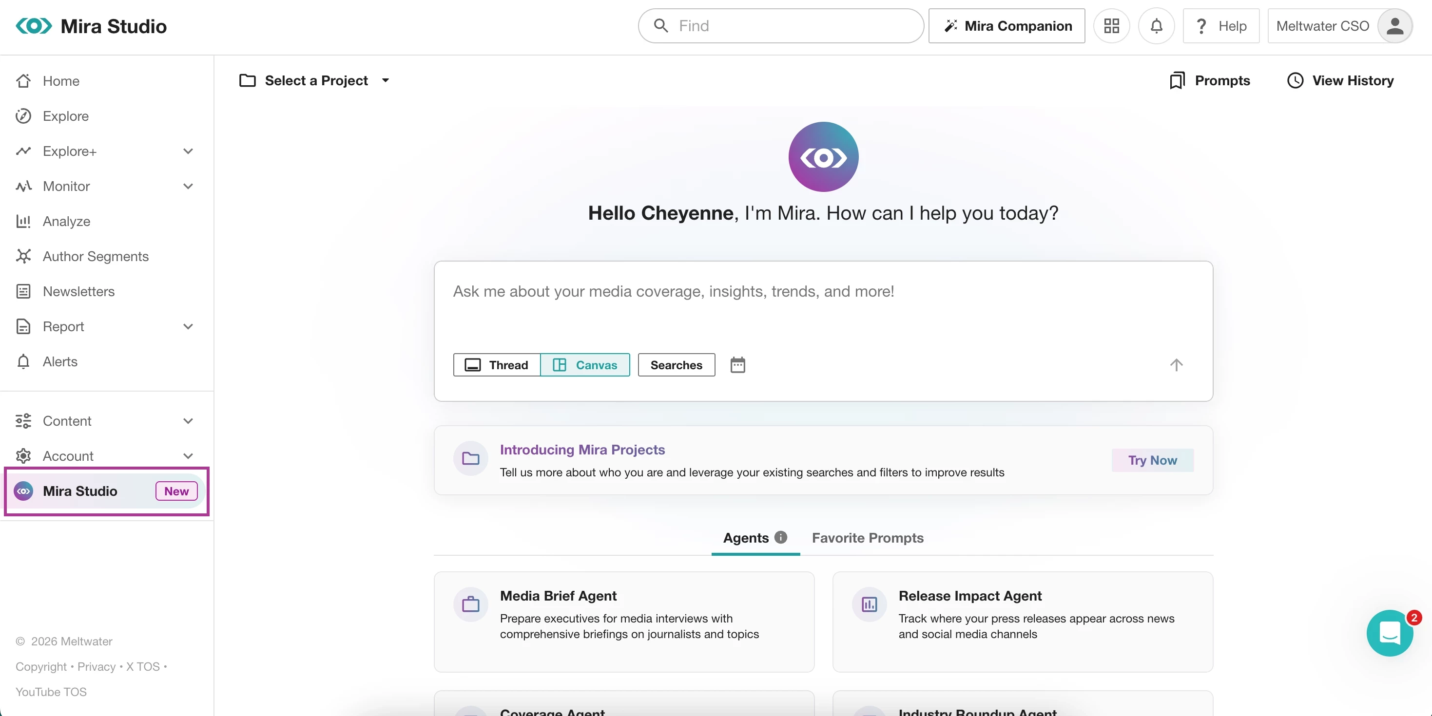
- Open Mira Studio (or AI Search Assistant → “Brief me on a topic”)
- Compare brands or trends directly
Try prompting:
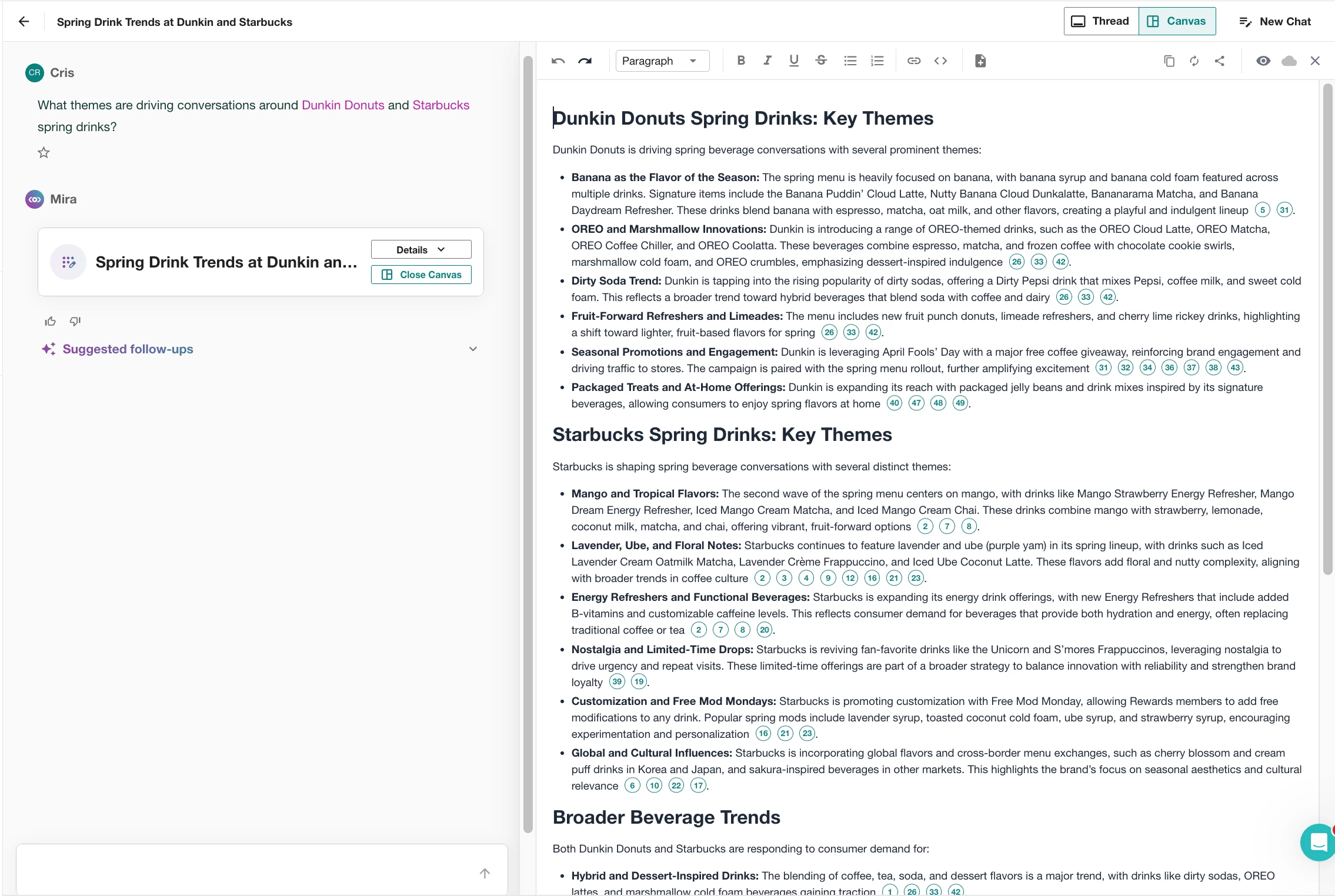
- “Compare Starbucks vs Dunkin coverage this quarter”
- “What themes are driving conversations around Starbucks and Dunkin Donuts spring drinks?”
- “Why is Starbucks seeing more engagement than Dunkin?”
Mira will help you identify:
- Key narratives (seasonal launches, pricing, brand positioning)
- Differences in how each brand shows up in conversation
- The context behind spikes and sentiment shifts
Step 4: Apply — Turn insights into something your team can use
Now bring everything together. From here, you can:
- Add a text widget in Analyze to explain key takeaways from Mira
- Pull insights into a external report or email
- Combine charts + narrative to tell a clear story
Then, share your insights in the format that works best for your team:
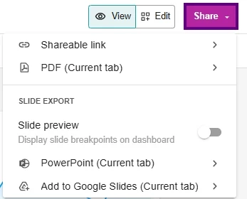
- Generate a live dashboard link for real-time updates
- Export as a PDF report for quick distribution
- Download to PowerPoint or Google Slides for presentations
If you want to see what strong outputs look like, browse examples from our Road to Summit Challenge—you’ll find real dashboards and reports built from people around the world.
Want to see AI prompts in action? Check out our monthly AI Prompt Challenges for real examples you can try yourself.