


🍁 Don’t Let Insights Fall Through the Cracks 🍁
How to Use Dashboard Tabs for Quarter-over-Quarter Reporting
Whether you're measuring campaign performance across Q3 vs. Q4 or comparing brand awareness this holiday season to last year’s, there's an easy way to do it without building a whole new dashboard.
Just add a new tab to your existing Unified Dashboard! It’s fast, repeatable, and makes side-by-side comparisons a breeze.
Let’s walk through it using a fan favorite: Starbucks ☕️
🔄 Step 1: Choose a Template to Kick Things Off
If you haven’t created your dashboard yet, start with a template like:
-
Brand Template (great for tracking awareness and sentiment)
-
Campaign Template (perfect for Pumpkin Spice Latte season) or
-
Benchmark Template (compare Starbucks with Dunkin’, Peet’s, or local brands)
Head to Analyze and click Create Unified Dashboard.
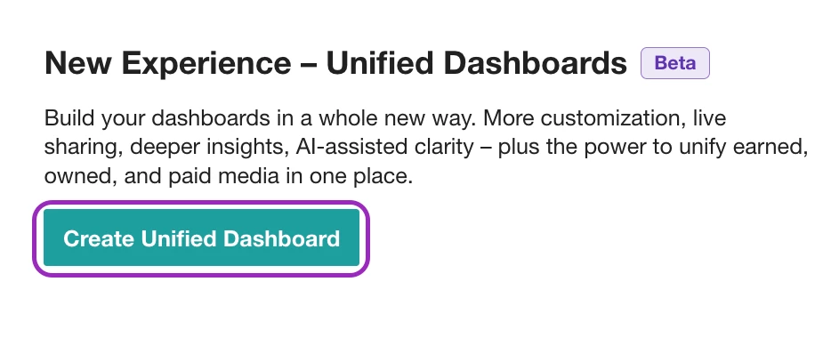
Select your template, choose your saved search(es) (e.g., Starbucks, Dunkin’), give your dashboard a name, pick a folder to save it in, and then click Create!
➕ Step 2: Add a New Tab to Compare Time Periods
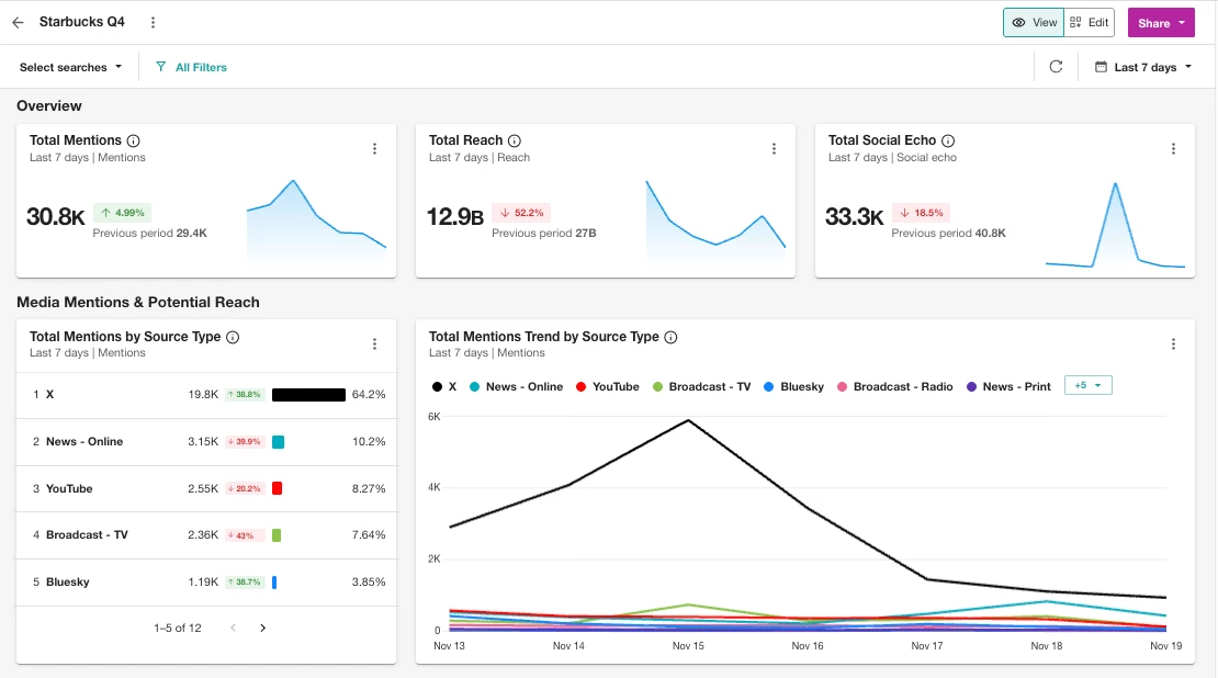
Already have a dashboard tracking Q4 2025 conversations for Starbucks? Let’s compare it to Q3 2025.
Here’s how to add a tab:
-
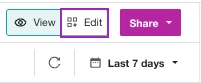
Open your dashboard in Edit mode
-
Click the tab’s Downward Arrow and select Duplicate
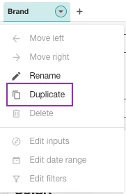
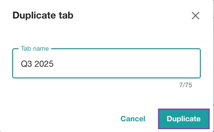
-
Name it “Q3 2025” and hit Duplicate
-
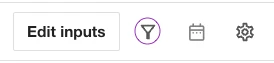
Click into your new tab and use the calendar icon (top right) to set the date range to Last quarter
📆 Pro Tip: Use the filter icon to apply Source, Location, etc. views to all widgets at once.
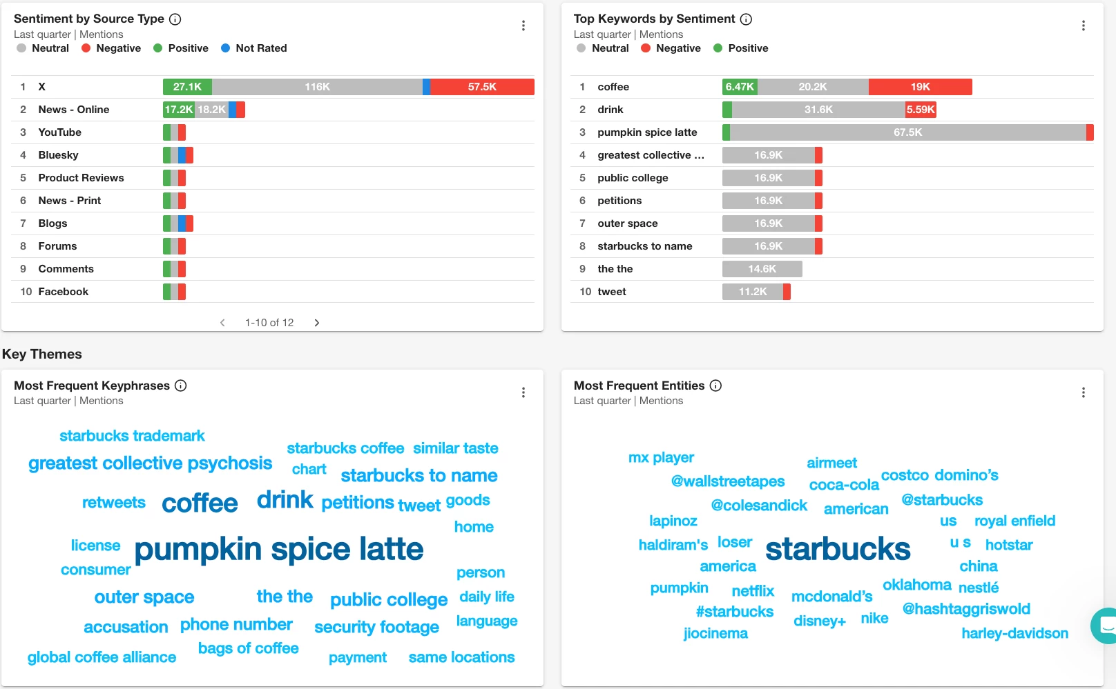
Step 3: Flip Between Tabs Like a Reporting Pro
Now you’ve got all your seasonal reporting in one place — no copy/pasting, no extra dashboards.
Compare things like:
-
📈 Mentions and Reach Trend: Did the Pumpkin Spice Latte hit earlier or trend longer this year?
-
🗣 Sentiment: Was there more love or backlash around seasonal menu changes?
-
📍 Most Frequent Keyphrases & Entities: What companies and words are associated with our brand?
🛠 Need Help Getting Started?
🎥 Want to See It in Action?
Join the Getting Started with Report Building workshop on Nov 27th!
You’ll get a live walkthrough of how to build and edit Unified Dashboards, including adding tabs like we just covered.
📣 Have you tried using tabs yet? Drop your example in the comments- maybe a favorite brand, campaign, or seasonal trend you’re tracking!