


📊 Create a Brand Dashboard You Can Schedule in Minutes
Have you built your Explore search and trying to figure out how to build a dashboard in Meltwater that shows your brand’s performance? You’re in the right place.
Today, we’re building a beginner-friendly dashboard using Universal Dashboards (UDS) in Analyze that shows:
-
AI-powered Analysis
-
Volume + Sentiment trends over time
-
Brand vs. competitor performance
-
How to share your report
For this walkthrough, we’ll follow the marketing team at Chipotle, who want to see how their brand is performing during Super Bowl season — and how they stack up against QDOBA and Taco Bell.
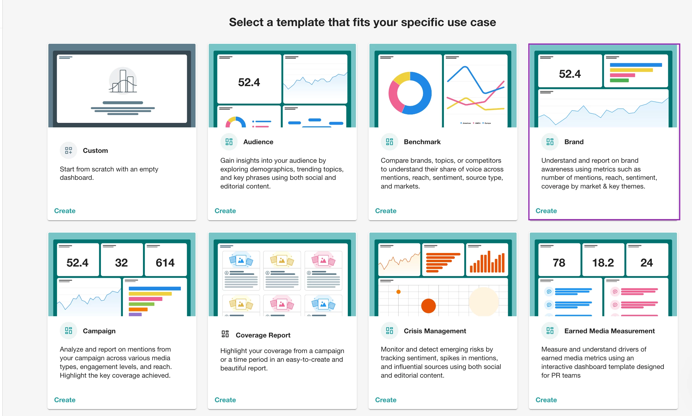
🧱 Step 1: Start with a Template
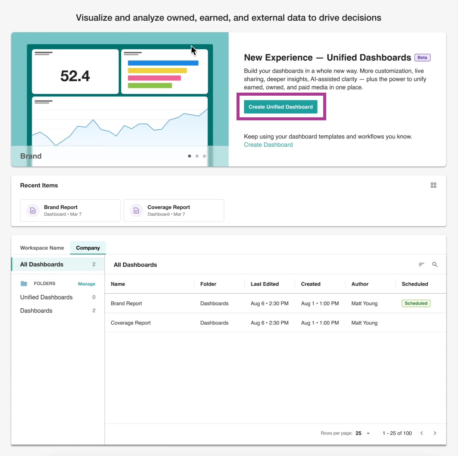
First, go to Analyze, then select Create Unified Dashboard. You’ll be prompted to choose a template.
For this workflow, we recommend to start with the “Brand ” report template.
It’s pre-loaded with helpful widgets like top themes, average sentiment, and coverage over time.
Then:
-
Select your saved Explore search (Chipotle)
-
Name your dashboard (e.g., “Chipotle Brand Performance – Q1 2026”) and choose the folder to save it in
-
Hit Create
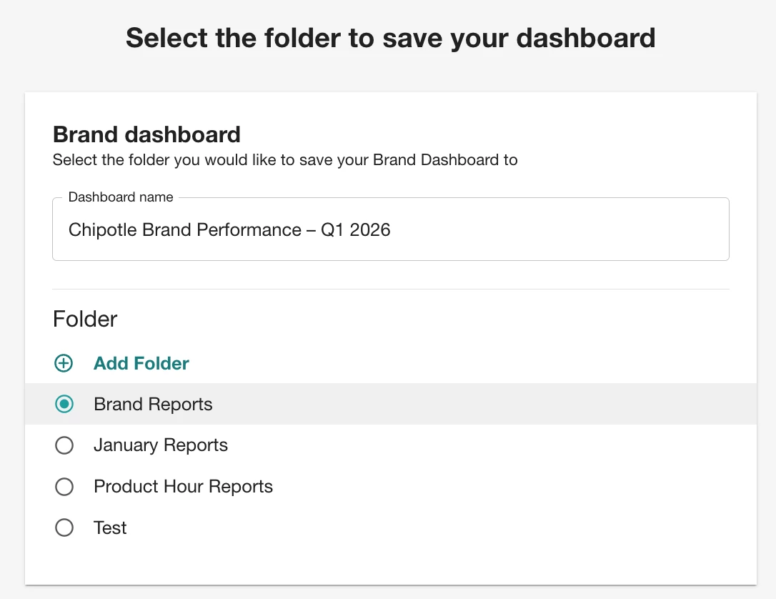
💡 Pro Tip: You can always add a second brand (like Taco Bell) as a separate tab later.
🎛️ Step 2: How to Customize a Dashboard in Meltwater
Now that you’ve created your dashboard, you’ll land on a pre-populated view using the template you selected.
To customize:
-
Click Edit at the top right of the dashboard
-
Hover over any hamburger menu on a widget to delete, resize, or move it
-
Want to add something new? Insert a new row and click ➕ Add Widget
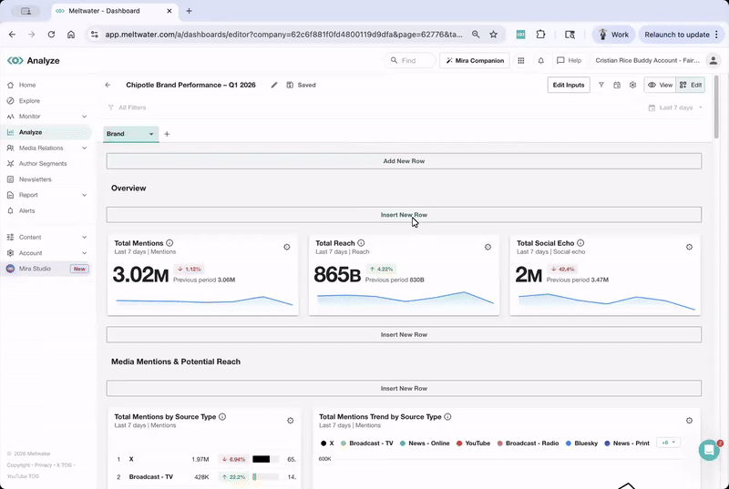
If you’re wondering how to add sentiment or volume widgets to a dashboard — this is where you do it.
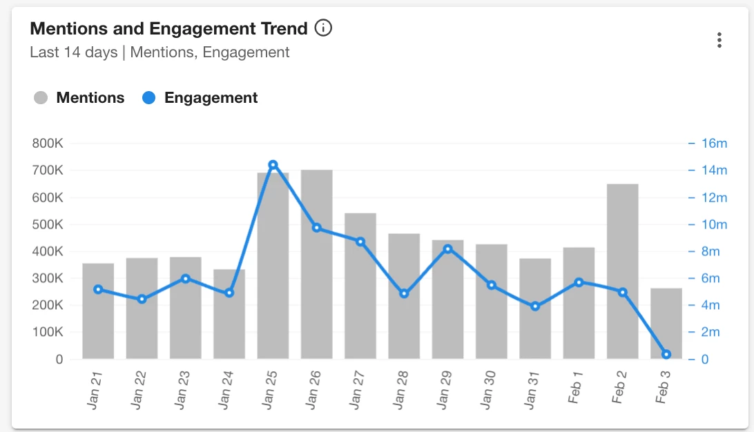
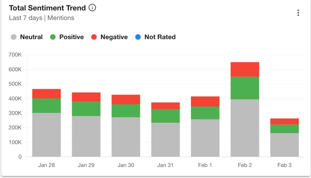
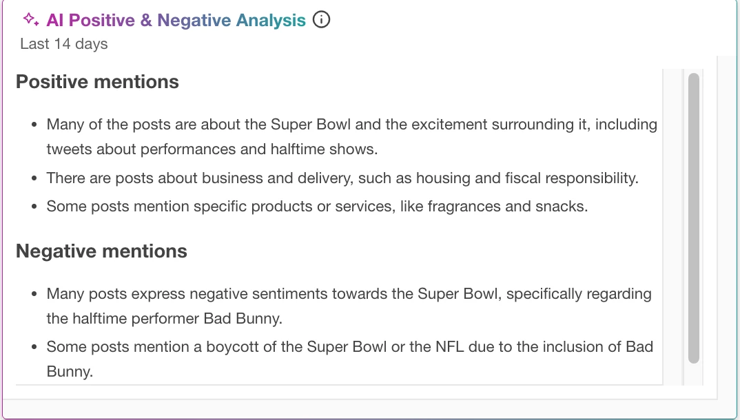
You’ll see widget types grouped by purpose. To visualize brand performance, we recommend:
-
Mentions and Engagement Trend → to track spikes and dips in volume & engagement
-
Total Sentiment Trend → for positive and negative perception shifts
-
AI Positive & Negative Analysis → for summarizing what’s driving the conversation
-
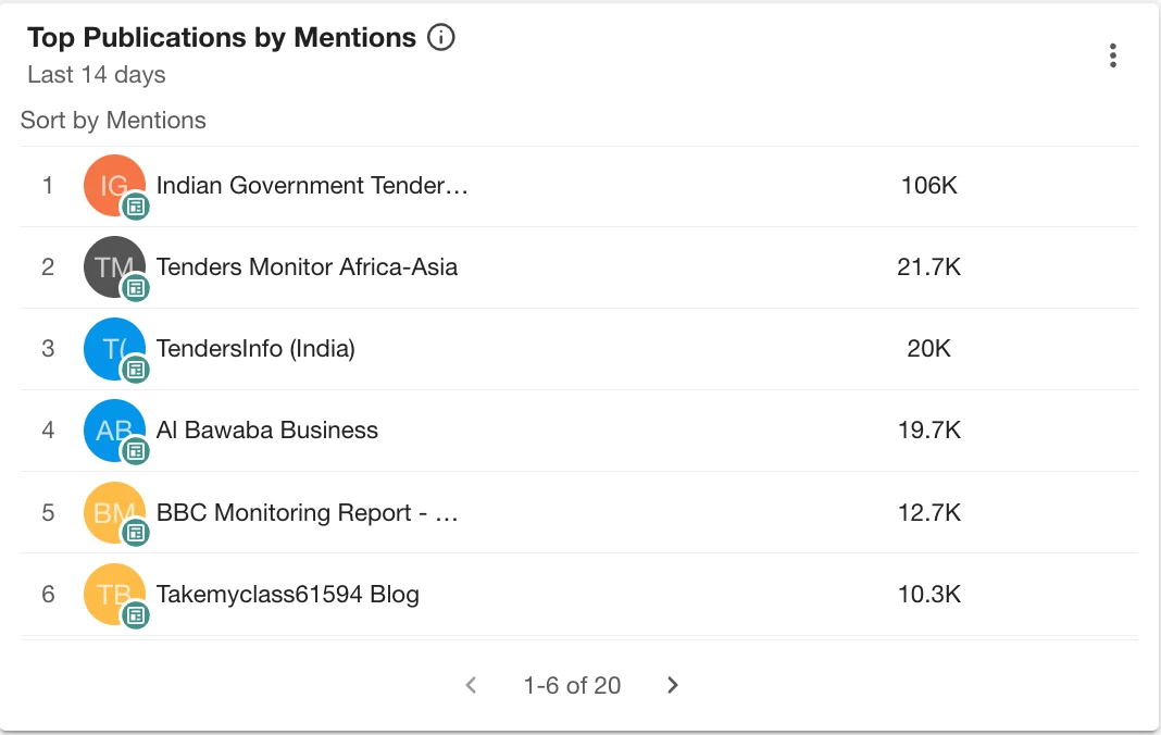
Top Publications by Mentions → to see where you're being mentioned most
These widgets auto-populate based on the saved search you selected (e.g., Chipotle).
📂 Step 3: How to Add Competitor Comparison in a Dashboard
Now, let’s say Chipotle wants to track how they stack up against Taco Bell.
Here’s how:
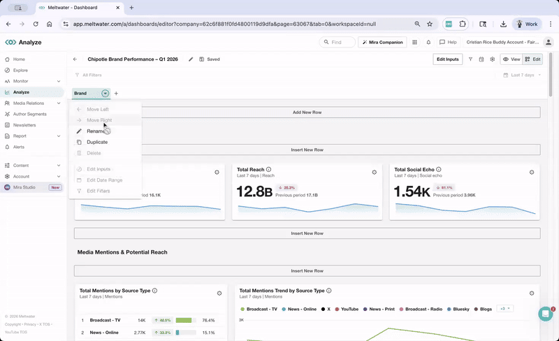
-
While in Edit mode, click the drop-down arrow at the top left next to “Brand” tab
-
Select Duplicate (This will keep all your same widgets intact)
-
Name the tab (e.g., “Taco Bell – Q1 2026”)
-
Click the drop-down arrow next to the new tab
-
Select Edit Inputs and pick the competitor search (Taco Bell)
-
Click View at the top right to see it in action!
You now have the same widgets from Step 2 so your comparisons stays consistent.
📂 Step 4: How to Share a Dashboard Report in Meltwater
Once your report looks good, you should share it!
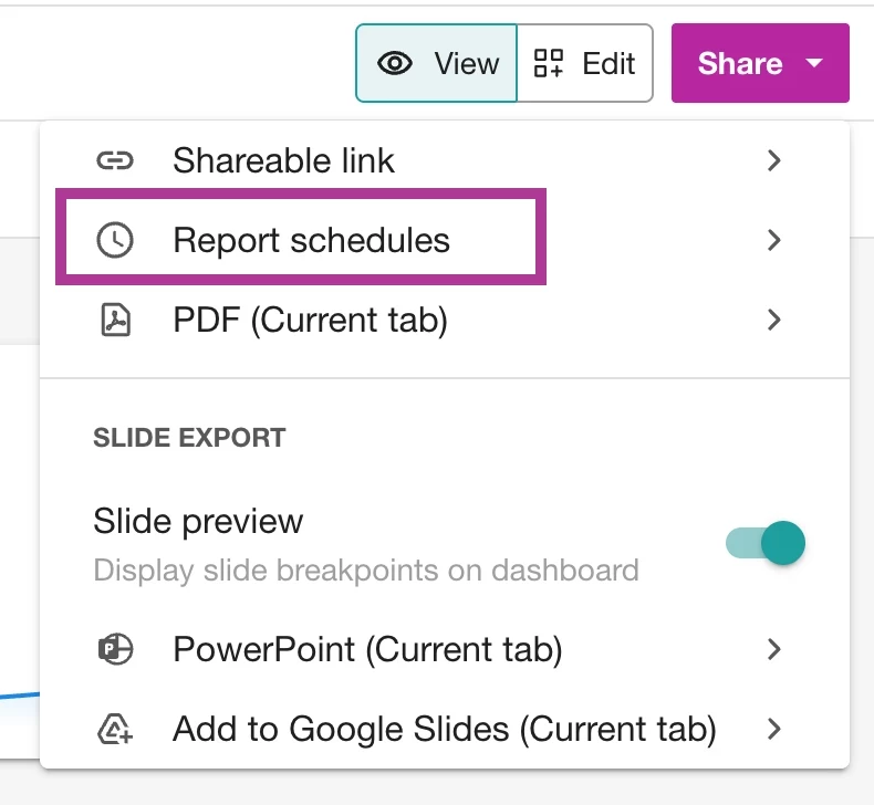
While in View mode, in the upper right corner, click Share to choose from:
-
Interactive Link → live dashboard view (great for leadership)
-
PowerPoint or Google Slides → quick drop into reporting decks
-
PDF → static summary to send via email
-
Schedule Export → to send reports on a recurring basis
📌 Learn more in this guide: Sharing Your Unified Dashboard
🗣️ How do You like to Share?
Have you created a dashboard you’re proud of? What’s your go-to widget or way to share?
👇 Drop your favorite tips in the comments — and if you're just getting started, join our live Report Building Workshop to see it in action.